在网页布局的学习中,我们经常会遇到弹性(Flex)布局,那么弹性(Flex)布局究竟是什么样子的呢?相信你学完了本篇文章就会明白Flex(弹性)布局的真正的意思了。
Flexbox 是 flexible box 的简称(注:意思是“灵活的盒子容器”),是 CSS3 引入的新的布局模式。它决定了元素如何在页面上排列,使它们能在不同的屏幕尺寸和设备下可预测地展现出来。
它之所以被称为 Flexbox ,是因为它能够扩展和收缩 flex 容器内的元素,以最大限度地填充可用空间。与以前布局方式(如 table 布局和浮动元素内嵌块元素)相比,Flexbox 是一个更强大的方式:
虽然 Flexbox 非常适合缩放,对齐和重新排序元素,但以下情况应该尽量避免使用 Flexbox 布局:
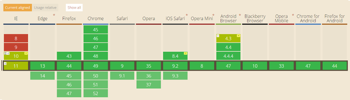
旧版浏览器,如IE 11或更低版本,不支持或仅部分支持 Flexbox 。如果你想安全的使用页面正常呈现,你应该退回到其他的 CSS 布局方式,比如结合float 的 display: inline-block 或者 display: table 等。但是,如果您只针对现代浏览器,那么 Flexbox 绝对值得一试。
在 Flexbox 模型中,有三个核心概念:
– flex 项(愚人码头注:也称 flex 子元素),需要布局的元素
– flex 容器,其包含 flex 项
– 排列方向(direction),这决定了 flex 项的布局方向(注:更多的文章叫主轴)
最好的学习方式是从经验和例子中学习,所以让我们开始吧!
CSS 代码:
.flex-container {display: flex;}
代码如下:
HTML:
<div class="flex-container">
<div class="flex-item">1</div>
<div class="flex-item">2</div>
</div>
CSS:
.flex-container {
 display: flex;
}
/* 以下为辅助样式 */
.flex-container{
 background-color: #F0f0f0;
}
.flex-container .flex-item{
 padding:20px;
 background-color: #B1FF84;
}
.flex-container .flex-item:first-child{
 background-color: #F5DE25;
}
.flex-container .flex-item:last-child{
 background-color: #90D9F7;
}
效果如下:
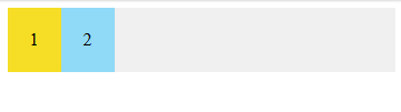
要创建一个 flex 容器,您只需要将一个 display: flex 属性添加到一个元素上。默认情况下,所有的直接子元素都被认为是 flex 项,并从左到右依次排列在一行中。如果 flex 项的宽度总和大于容器,那么 flex 项将按比例缩小,直到它们适应 flex 容器宽度。
CSS 代码:
.flex-container {display: flex;flex-direction: column;}
代码如下:
HTML:
<div class="flex-container">
<div class="flex-item">1</div>
<div class="flex-item">2</div>
</div>
CSS:
.flex-container {
 display: flex;
 flex-direction: column;
}
/* 以下为辅助样式 */
.flex-container{
 background-color: #F0f0f0;
}
.flex-container .flex-item{
 padding:20px;
 background-color: #B1FF84;
}
.flex-container .flex-item:first-child{
 background-color: #F5DE25;
}
.flex-container .flex-item:last-child{
 background-color: #90D9F7;
}
效果如下:
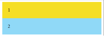
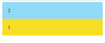
可以通过(在 flex 容器中)设置 flex-direction: column 使 flex 项垂直布局。也可以通过设置 flex-direction: column-reverse 或 flex-direction: row-reverse 来使 flex 项以相反的顺序排列。
CSS 代码:
.flex-container {display: flex;flex-direction: column-reverse;}
代码如下:
HTML:
<div class="flex-container">
<div class="flex-item">1</div>
<div class="flex-item">2</div>
</div>
CSS:
.flex-container {
 display: flex;
 flex-direction: column-reverse;
}
/* 以下为辅助样式 */
.flex-container{
 background-color: #F0f0f0;
}
.flex-container .flex-item{
 padding:20px;
 background-color: #B1FF84;
}
.flex-container .flex-item:first-child{
 background-color: #F5DE25;
}
.flex-container .flex-item:last-child{
 background-color: #90D9F7;
}
效果如下:
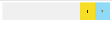
CSS 代码:
.flex-container {display: flex;justify-content: flex-end;}
回想一下,每个 Flexbox 模型都有 flex 方向(主轴)。justify-content 用于指定 flex 项在 flex 方向(direction)上的对齐位置。在上面的例子中,justify-content:flex-end 表示 flex 项在水平方向上靠 flex 容器的末端对齐。这就是为什么他们被放在了右边。
代码如下:
HTML:
<div class="flex-container">
<div class="flex-item">1</div>
<div class="flex-item">2</div>
</div>
CSS:
.flex-container {
 display: flex;
 justify-content: flex-end;
}
/* 以下为辅助样式 */
.flex-container{
 background-color: #F0f0f0;
}
.flex-container .flex-item{
 padding:20px;
 background-color: #B1FF84;
}
.flex-container .flex-item:first-child{
 background-color: #F5DE25;
}
.flex-container .flex-item:last-child{
 background-color: #90D9F7;
}
效果如下:
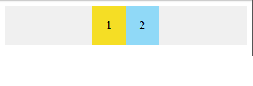
CSS 代码:
.flex-container {display: flex;justify-content: center;}
代码如下:
HTML:
<div class="flex-container">
<div class="flex-item">1</div>
<div class="flex-item">2</div>
</div>
CSS:
.flex-container {
 display: flex;
 justify-content: center;
}
/* 以下为辅助样式 */
.flex-container{
 background-color: #F0f0f0;
}
.flex-container .flex-item{
 padding:20px;
 background-color: #B1FF84;
}
.flex-container .flex-item:first-child{
 background-color: #F5DE25;
}
.flex-container .flex-item:last-child{
 background-color: #90D9F7;
}
效果如下:
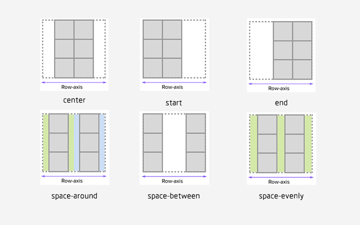
您可以通过使用以下 justify-content 属性的三个间距值之一来指定容器中 flex 项之间应显示多少空间:
注:网上找了一张图片能更好的解释 justify-content 属性值的表现,如图:
CSS 代码:
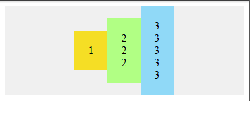
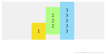
.flex-container {display: flex;justify-content: center;align-items: center;}
通常,我们想沿着 flex 方向(主轴)排列 flex 项,还可以在垂直于它的方向(交叉轴)上对齐 flex 项。通过设置 justify-content:center和align-items:center,可以使 flex 项水平和垂直放置在 flex 容器的中心。
HTML:
<div class="flex-container">
<div class="flex-item">1</div>
<div class="flex-item">2 <br />2<br />2</div>
<div class="flex-item">3 <br />3<br /> 3<br /> 3<br /> 3</div>
</div>
CSS:
.flex-container {
 display: flex;
 justify-content: center;
 align-items: center;
}
/* 以下为辅助样式 */
.flex-container{
 background-color: #F0f0f0;
}
.flex-container .flex-item{
 padding:20px;
 background-color: #B1FF84;
}
.flex-container .flex-item:first-child{
 background-color: #F5DE25;
}
.flex-container .flex-item:last-child{
 background-color: #90D9F7;
}
效果如下:
CSS 代码:
.flex-container {display: flex;align-items: center;}
.flex-bottom {align-self: flex-end;}
可以在某个特定的 flex 项上使用 align-self CSS 属性,来使该特定的 flex 项与容器中的其他 flex 项进行对齐。
代码如下:
HTML:
<div class="flex-container">
<div class="flex-item flex-bottom">1</div>
<div class="flex-item">2 <br />2<br />2</div>
<div class="flex-item">3 <br />3<br /> 3<br /> 3<br /> 3</div>
</div>
CSS:
.flex-container {
 display: flex;
 justify-content: center;
 align-items: center;
}
.flex-bottom {
 align-self: flex-end;
}
/* 以下为辅助样式 */
.flex-container{
 background-color: #F0f0f0;
}
.flex-container .flex-item{
 padding:20px;
 background-color: #B1FF84;
}
.flex-container .flex-item:first-child{
 background-color: #F5DE25;
}
.flex-container .flex-item:last-child{
 background-color: #90D9F7;
}
效果如下:
Level 3?—?中级
1)允许 flex 项多行/列排列
CSS 代码:
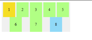
.flex-container {display: flex;flex-wrap: wrap;}
默认情况下, flex 项不允许多行/列排列,如果 flex 容器尺寸对于所有 flex 项来说不够大,那么flex 项将被调整大小以适应单行或列排列。
通过添加 flex-wrap: wrap ,可以将溢出容器的 flex 项将被排列到另一行/列中。
代码如下:
HTML:
<div class="flex-container">
 <div class="flex-item">1</div>
 <div class="flex-item">2</div>
 <div class="flex-item">3</div>
 <div class="flex-item">4</div>
 <div class="flex-item">5</div>
 <div class="flex-item">6</div>
 <div class="flex-item">7</div>
<div class="flex-item">8</div>
</div>
CSS:
.flex-container {
 display: flex;
 justify-content: space-evenly;
 flex-wrap: wrap;
}
/* 以下为辅助样式 */
.flex-container{
 width:270px;
 background-color: #F0f0f0;
}
.flex-container .flex-item{
 padding:20px;
 background-color: #B1FF84;
}
.flex-container .flex-item:first-child{
 background-color: #F5DE25;
}
.flex-container .flex-item:last-child{
 background-color: #90D9F7;
}
效果如下:
CSS 代码:
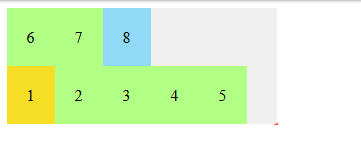
.flex-container {display: flex;flex-wrap: wrap-reverse;}
flex-wrap:wrap-reverse 仍然使 flex 项以多行/列排列,但是它们从 flex 容器的末尾开始排列的。
代码如下:
HTML:
<div class="flex-container">
 <div class="flex-item">1</div>
 <div class="flex-item">2</div>
 <div class="flex-item">3</div>
 <div class="flex-item">4</div>
 <div class="flex-item">5</div>
 <div class="flex-item">6</div>
 <div class="flex-item">7</div>
 <div class="flex-item">8</div>
</div>
CSS:
.flex-container {
 display: flex;
 flex-wrap: wrap-reverse;
}
/* 以下为辅助样式 */
.flex-container{
 width:270px;
 background-color: #F0f0f0;
}
.flex-container .flex-item{
 padding:20px;
 background-color: #B1FF84;
}
.flex-container .flex-item:first-child{
 background-color: #F5DE25;
}
.flex-container .flex-item:last-child{
 background-color: #90D9F7;
}
效果如下:
CSS 代码:
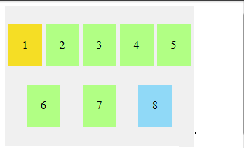
.flex-container {display: flex;flex-wrap: wrap;align-content: flex-start;}
默认情况下,当 flex 容器的交叉轴(cross axis)上存在多余空间时,您可以在 flex 容器上设置 align-content,以控制 flex 项在交叉轴(cross axis)上的对齐方式。可能的值是 flex-start,flex-end,center,space-between,space-around ,space-evenly 和 stretch(默认)。
代码如下:
HTML:
<div class="flex-container">
 <div class="flex-item">1</div>
 <div class="flex-item">2</div>
 <div class="flex-item">3</div>
 <div class="flex-item">4</div>
 <div class="flex-item">5</div>
 <div class="flex-item">6</div>
 <div class="flex-item">7</div>
 <div class="flex-item">8</div>
</div>
CSS:
.flex-container {
 display: flex;
 flex-wrap: wrap;
 justify-content: space-evenly;
 align-content: space-evenly;
}
/* 以下为辅助样式 */
.flex-container{
 width:270px;
 height:200px;
 background-color: #F0f0f0;
}
.flex-container .flex-item{
 padding:20px;
 height:20px;
 background-color: #B1FF84;
}
.flex-container .flex-item:first-child{
 background-color: #F5DE25;
}
.flex-container .flex-item:last-child{
 background-color: #90D9F7;
}
效果如下:
更多内容请关注我!!!
原文:https://www.cnblogs.com/xsd1/p/12870126.html