第一篇 第一章
图1.1
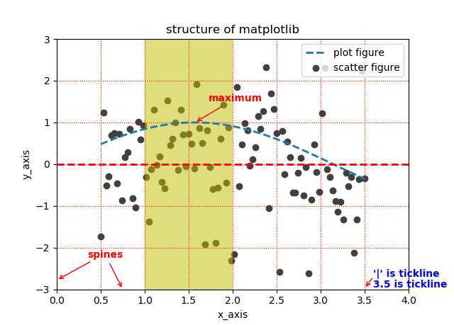
import matplotlib.pyplot as plt
import numpy as np

from matplotlib import cm as cm

#define data
x=np.linspace(0.5, 3.5, 100)
y=np.sin(x)
y1=np.random.randn(100)

#scatter figure
plt.scatter(x, y1, c=‘0.25‘, label=‘scatter figure‘)

#plot figure
plt.plot(x, y, ls=‘--‘, lw=2, label=‘plot figure‘)

#some clean up
#去掉上边框和有边框
for spine in plt.gca().spines.keys():
    if spine==‘top‘ or spine==‘right‘:
        plt.gca().spines[spine].set_color(‘none‘)

# x轴的刻度在下边框
plt.gca().xaxis.set_ticks_position(‘bottom‘)

# y轴的刻度在左边框
plt.gca().yaxis.set_ticks_position(‘left‘)

#设置x轴、y轴范围
plt.xlim(0.0, 4.0)
plt.ylim(-3.0, 3.0)

#设置x轴、y轴标签
plt.xlabel(‘x_axis‘)
plt.ylabel(‘y_axis‘)

#绘制x、y轴网格
plt.grid(True, ls=‘:‘, color=‘r‘)

#绘制水平参考线
plt.axhline(y=0.0, c=‘r‘, ls=‘--‘, lw=2)

#绘制垂直参考区域
plt.axvspan(xmin=1.0, xmax=2.0, facecolor=‘y‘, alpha=0.5)

#绘制注解
plt.annotate(‘maximum‘, xy=(np.pi/2, 1.0), xytext=((np.pi/2)+0.15, 1.5),
             weight=‘bold‘, color=‘r‘, arrowprops=dict(arrowstyle=‘->‘,
             connectionstyle=‘arc3‘, color=‘r‘))

#绘制注解
plt.annotate(‘spines‘, xy=(0.75, -3), xytext=(0.35, -2.25),
             weight=‘bold‘, color=‘r‘, arrowprops=dict(arrowstyle=‘->‘,
             connectionstyle=‘arc3‘, color=‘r‘))

#绘制注解
plt.annotate(‘‘, xy=(0, -2.78), xytext=(0.4, -2.32),
             weight=‘bold‘, color=‘r‘, arrowprops=dict(arrowstyle=‘->‘,
             connectionstyle=‘arc3‘, color=‘r‘))

#绘制注解
plt.annotate(‘‘, xy=(3.5, -2.98), xytext=(3.6, -2.7),
             weight=‘bold‘, color=‘r‘, arrowprops=dict(arrowstyle=‘->‘,
             connectionstyle=‘arc3‘, color=‘r‘))

#绘制文本
plt.text(3.6, -2.70, "‘|‘ is tickline", weight=‘bold‘, color=‘b‘)
plt.text(3.6, -2.95, "3.5 is tickline", weight=‘bold‘, color=‘b‘)


plt.title("structure of matplotlib")

plt.legend(loc=‘upper right‘)

plt.show()
=======================================================
Python数据可视化之matplotlib实践 源码 第一篇 入门 第一章
原文:https://www.cnblogs.com/devilmaycry812839668/p/12887452.html