一般来说,水平垂直居中不管是在项目还是面试中都屡见不鲜。
故而写篇博客小结一下。
此文将从父子元素宽高已知或未知的角度分开讨论。
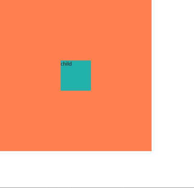
以下是DOM、样式表以及效果图。由于效果一致,下面将不再频繁列出。
html
    <div class="parent">
        <div class="child">child</div>
    </div>
css
    .parent {
        height: 500px;
        width: 500px;
        background-color: coral;
    }

    .child {
        height: 100px;
        width: 100px;
        background-color: lightseagreen;
    }
效果图
margin+绝对定位是css水平垂直居中里一种较为常见的方案
由于绝对定位的百分比是基于父元素来计算的,因此需要减去子元素宽高的一半,达到子元素和父元素中位线对齐的效果,从而实现居中
为什么使用负margin+px?负margin+百分比行不行?
当然不行。因为在这里margin的百分比也是基于父元素计算的。
.parent{
    position: relative;
}
.child{
    position: absolute;
    left: 50%;
    top: 50%;
    margin-left: -50px;
    margin-top: -50px;
}
思路和上一种方法类似。calc的百分比基于父元素计算。因此需要减去子元素宽高的一半。
.parent{
    position: relative;
    overflow: hidden;
}
.child{
    position: absolute;
    left:calc(50% - 50px);
    top: calc(50% - 50px);
}
.parent{
        position: relative;
}
.child{
    position: absolute;
    left: 50%;
    top: 50%;
    margin-left: -50px;
    margin-top: -50px;
}
translate用于在平面内进行平移。由于tanslate的百分比是基于自身计算的,因此可以结合定位实现未知宽高的居中
.parent{
    position: relative;
}
.child{
    position: absolute;
    top: 50%;
    left: 50%;
    transform: translate(-50%,-50%);
}
利用弹性盒模型实现居中。只需要设置flex父元素的align-items和justice-content为center就可以做到水平垂直居中。是比较简洁实用的一种方案。
缺陷是兼容性不是很好,需要IE9以上版本
.parent {
    display: flex;
    align-items: center;
    justify-content: center;
}
代码和flex一样简洁,只需设置父元素display为grid,设置子元素align-self和justify-self为center,即可实现居中效果
缺陷是IE兼容性极其不好
.parent{
    display: grid;
}
.child{
    align-self: center;
    justify-self: center;
}
.parent{
    display: table-cell;
    text-align: center;
    vertical-align: middle;
}
.child{
    width: auto;
    height: auto;
    display: inline-block;
}
原文:https://www.cnblogs.com/ltfxy/p/12907914.html