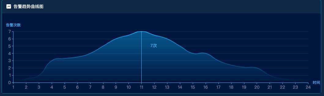
直接上效果图
属性注释
option = {
        title: {
            padding:[28,0,0,16],
            text: ‘哈哈‘,
            textStyle: {//标题样式
                fontWeight: "normal",
                color: "#59DAE8",
                fontSize: 14,
                left:‘center‘,
             },
        },
        backgroundColor: ‘#001848‘,//整个绘图背景色
        grid: { //绘图在容易中的位置
            left: ‘2%‘,
            right: ‘5%‘,
            bottom: ‘5%‘,
            containLabel: true //grid 区域是否包含坐标轴的刻度标签。false可能溢出
        },
        xAxis: {
            name:‘时间‘,//x轴标题
            //  ‘value‘ 数值轴,适用于连续数据。
            //  ‘category‘ 类目轴,适用于离散的类目数据,为该类型时必须通过 data 设置类目数据。
            //  ‘time‘ 时间轴,适用于连续的时序数据,与数值轴相比时间轴带有时间的格式化,在刻度计算上也有所不同,例如会根据跨度的范围来决定使用月,星期,日还是小时范围的刻度。
            //  ‘log‘ 对数轴。适用于对数数据。
            type: ‘category‘,
            axisTick:{
                show:true,//刻度线
            },
            boundaryGap: false,
            axisLabel: {
                show: true,
                textStyle: {
                    color: ‘rgba(255,255,255,.5)‘,  //更改坐标轴文字颜色
                    fontSize : 14      //更改坐标轴文字大小
                }
            },
            axisLine:{
                lineStyle:{//x轴轴线的属性配置
                    color:‘rgba(87,192,255)‘,
                    width:1,
                }
            },
        },
        yAxis: {
            name:‘告警次数‘, //y轴标题
            type: ‘value‘,
            axisTick:{
                show:true,//显示刻度线
            },
            axisLabel: {
                show: true,
                textStyle: {
                    color: ‘rgba(255,255,255,.5)‘,  //更改坐标轴文字颜色
                    fontSize : 14      //更改坐标轴文字大小
                }
            },
            axisLine:{
                lineStyle:{//y轴的轴线的属性配置
                    width:1,
                    color:‘rgba(87,192,255)‘,
                }
            },
            splitLine: { //网格线属性配置
                show: true,
                lineStyle: {
                    color: ‘rgba(87,192,255,.2)‘,
                    width: 1,
                    type: ‘solid‘

                }
            }
        },
        tooltip : {
            trigger: ‘axis‘,
            backgroundColor:‘transparent‘,//提示数据的背景色
            // 其中变量a、b、c在不同图表类型下代表数据含义为:
            // 折线(区域)图、柱状(条形)图: a(系列名称),b(类目值),c(数值), d(无)
            // 散点图(气泡)图 : a(系列名称),b(数据名称),c(数值数组), d(无)
            // 饼图、雷达图 : a(系列名称),b(数据项名称),c(数值), d(百分比)
            // 弦图 : a(系列名称),b(项1名称),c(项1-项2值),d(项2名称), e(项2-项1值)
            // 力导向图 :
            // 节点 : a(类目名称),b(节点名称),c(节点值)
            // 边 : a(系列名称),b(源名称-目标名称),c(边权重), d(如果为true的话则数据来源是边)
            // {Function},传递参数列表如下:
            // <Array> params : 数组内容同模板变量,[[a, b, c, d], [a1, b1, c1, d1], ...]
            // <String> ticket : 异步回调标识
            // <Function> callback : 异步回调,回调时需要两个参数,第一个为前面提到的ticket,第二个为填充内容html
            formatter:‘<span style="color: rgba(87,192,255);">{c}‘+‘次</span>‘,//自定义数据格式 b:X轴数据
            axisPointer: {
                type: ‘line‘, // shadow cross line 三种类型
                crossStyle:{ //水平辅助线属性
                    color:‘#f00‘,
                    width:0
                },
                lineStyle:{ //竖线竖线
                    color:‘rgba(87,192,255)‘,
                },
                label: {
                    // backgroundColor: ‘rgba(87,192,255)‘,
                    // color:‘rgba(87,192,255)‘
                },
            }
        },
        series: [
            {
                type:‘line‘,
                symbol: ‘none‘, // 点的属性 ‘circle‘ , ‘rectangle‘, ‘triangle‘, ‘diamond‘,‘emptyCircle‘, ‘emptyRectangle‘, ‘emptyTriangle‘, ‘emptyDiamond‘
                smooth:true, //折线图变为曲线图
                itemStyle: { //曲线部分渐变
                    normal:{
                        // label : {
                        //     show: true
                        // },
                        //颜色渐变函数 前四个参数分别表示四个位置依次为左、下、右、上
                        color: new echarts.graphic.LinearGradient(0, 1, 0, 0, [{

                            offset: 0,
                            color: ‘rgba(13, 191, 255, 0)‘
                        }, {
                            offset: .5,
                            color: ‘rgba(13, 191, 255, .5)‘
                        },{
                            offset: 1,
                            color: ‘rgba(13, 191, 255, 1)‘
                        }])

                    }
                },
                areaStyle: { //阴影部分渐变
                    normal: {
                        color: new echarts.graphic.LinearGradient(0, 1, 0, 0, [{ //4个参数用于配置渐变色的起止位置, 这4个参数依次对应右/下/左/上四个方位. 而0 0 0 1则代表渐变色从正上方开始
                            offset: 0,
                            color: ‘rgba(13, 191, 255, 0)‘
                        }, {
                            offset: 0.75,
                            color: ‘rgba(13, 191, 255, .5)‘
                        },
                        {
                            offset: 1,
                            color: ‘rgba(13, 191, 255, .6)‘
                        },
                        ]) //这个数组代表着渐变的过程
                    }
                },
            }
        ]
    };
    option.xAxis.data = [‘1‘,‘2‘,‘3‘,‘4‘,‘5‘,‘6‘,‘7‘,‘8‘,‘9‘,‘10‘,‘11‘,‘12‘,‘13‘,‘14‘,‘15‘,‘16‘,‘17‘,‘18‘,‘19‘,‘20‘,‘21‘,‘22‘,‘23‘,‘24‘];
    option.series[0].data = [0,0.5,1,3,3.3,3.5,4,5,6,6.5,7,6.5,6,5,4,4,3,2.4,2.1,2,1,0.5,0.3,0];
    let chart = echarts.init(document.getElementById(‘chart‘));
    chart.setOption(option);
原文:https://www.cnblogs.com/it-Ren/p/13051045.html