场景一:元素缺角。
方法一:画三角形遮住要缺的角,三角形颜色和“画布”元素一样
第一步画完三角形后的:
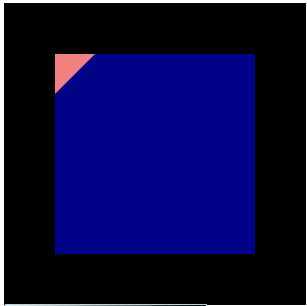
第二步:三角形取画布的黑色后
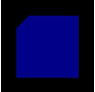
方法二:用css的渐变linear-gradient()。
  .way{
    width: 200px;
    height: 200px;
    margin: 0 auto;
    background:
// 渐变设置
    linear-gradient(135deg, transparent 40px, darkblue 0)
  }
结果如图:
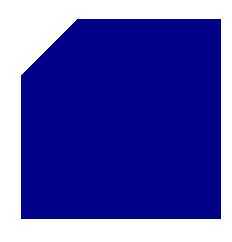
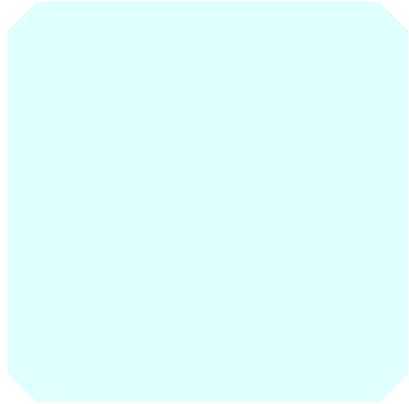
场景二:需要多个角
原理:四个单角的拼接完成
方法一:四个子元素用绝对定位拼接起来。
局限:如果父元素需要装整体的内容有局限,可以用只有装饰的。
    <div class="way">
      <div class="left-top"></div>
      <div class="right-top"></div>
      <div class="left-bottom"></div>
      <div class="right-bottom"></div>
    </div>
  .way{
    position: relative;
    height: 400px;
    width: 400px;
.left-top{
  height: 200px;
  width: 200px;
  background-color: lightcyan;
  position: absolute;
  top: 0px;
  left: 50%;
  background:
    linear-gradient(135deg, transparent 20px, darkblue 0) top left;
}
.right-top{
  height: 200px;
  width: 200px;
  position: absolute;
  top: 0px;
  left: 100%;
  background:
    linear-gradient(-135deg, transparent 20px, darkblue 0) top right,
}
.left-bottom{
  height: 200px;
  width: 200px;
  position: absolute;
  top: 50%;
  left: 100%;
  background:
    linear-gradient(-45deg, transparent 20px, darkblue  0) bottom right,
}
.right-bottom{
  height: 200px;
  width: 200px;
  position: absolute;
  bottom: 0%;
  right: 0%;
  background:
    linear-gradient(45deg, transparent 20px, darkblue  0) bottom right,
}
结果:
方法二:分块背景图设置
<div class="ways"></div>
  .ways{
    width: 400px;
    height: 400px;
    background:
    linear-gradient(135deg, transparent 20px, lightcyan 0) top left,
    linear-gradient(-135deg, transparent 20px, lightcyan 0) top right,
    linear-gradient(-45deg, transparent 20px, lightcyan 0) bottom right,
    linear-gradient(45deg, transparent 20px, lightcyan 0) bottom left;
  background-size: 50% 50%;
  background-repeat: no-repeat;
  }
结果:
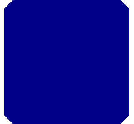
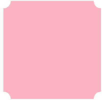
场景三: 弧度的角
方法:径向渐变
  .cricle{
     width: 400px;
    height: 400px;
    margin: 20px auto;
  background:
      radial-gradient(circle at top left, transparent 30px, lightPink 0) top left,
      radial-gradient(circle at top right, transparent 30px, lightPink 0) top right,
      radial-gradient(circle at bottom right, transparent 30px, lightPink 0) bottom right,
      radial-gradient(circle at bottom left, transparent 30px, lightPink 0) bottom left;
  background-size: 50% 50%;
  background-repeat: no-repeat;
  }
结果:
注意:
1、渐变:ie9及ie9之前的浏览器不支持渐变
原文:https://www.cnblogs.com/xieZhao/p/13039759.html