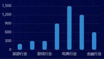
let box1 = document.getElementById(‘box1‘)
  let myEcharts = echarts.init(box1)
  let option = {
    title: {
      text: ‘柱状图-就业行业‘,
      left: ‘center‘,
      textStyle: {
        color: ‘#fff‘,
        fontSize: 14,
        fontWeight: 400
      }
    },
    tooltip: {
      show: true,
      trigger: ‘axis‘,
      axisPointer: {
        type: ‘shadow‘
      }

    },
    legend: {
      data: [‘2019‘],
      right: 10,
      textStyle: {
        color: ‘#fff‘,
        fontSize: 14,
        fontWeight: 400
      }


    },
    grid: {
      left: "4%",
      top: "20%",
      right: "4%",
      bottom: "4%",
      containLabel: true
    },
    xAxis: {
      type: ‘category‘,
      axisLine: {
        show: false
      },
      axisTick: {
        show: false
      },
      axisLabel: {
        color: "rgba(255,255,255,.6)",
        fontSize: "12"
      },
      data: ["旅游行业",
        "教育培训",
        "游戏行业",
        "医疗行业",
        "电商行业",
        "社交行业",
        "金融行业"]
    },
    yAxis: {
      axisLine: {
        show: true,
        lineStyle: { color: ‘rgba(255,255,255,.1)‘ }
      },
      axisTick: {
        show: true
      },
      axisLabel: {
        color: "rgba(255,255,255,.6)",
        fontSize: "12"
      },
      splitLine: {
        lineStyle: {
          color: ‘rgba(255,255,255,.1)‘
        }
      }
    },
    series: [{
      name: ‘2019‘,
      type: ‘bar‘,
      barWidth: ‘35%‘, // 宽度
      itemStyle: {
        color: ‘#2F89CF‘,
        barBorderRadius: 5, //圆角

      },
      data: [200, 300, 300, 900, 1500, 1200, 600],
    }]
  }
  myEcharts.setOption(option)

// box6 bar单色渐变+标签设置
(function () {
  let box6 = document.getElementById(‘box6‘)
  let myEcharts = echarts.init(box6)
  let option = {
    title: {
      text: ‘柱状图-单色渐变+标签设置‘,
      left: ‘center‘,
      textStyle: {
        color: ‘#fff‘,
        fontSize: 14,
        fontWeight: 400
      }
    },

    grid: {
      left: "4%",
      top: "10%",
      right: "0%",
      bottom: "0%",
      containLabel: true
    },
    xAxis: [{
      type: ‘category‘,

      data: [‘2016‘, ‘2017‘, ‘2018‘, ‘2019‘, ‘2020‘],

      axisLine: {
        show: false
      },
      axisTick: {
        show: false
      },
      axisLabel: {
        margin: 10,
        color: "rgba(255,255,255,.6)",
        fontSize: "12"
      },


    }],
    yAxis: [{
      min: 0,
      max: 100,
      axisLabel: {
        formatter: ‘{value}%‘,
        color: "rgba(255,255,255,.6)",
        fontSize: 12
      },
      axisLine: {
        lineStyle: {
          color: ‘rgba(255,255,255,.1)‘
        }
      },
      axisTick: {
        show: false
      },
      splitLine: {
        lineStyle: {
          color: ‘rgba(131,101,101,0.2)‘,
          type: ‘dashed‘,
        }
      }
    }],
    series: [{
      type: ‘bar‘,
      data: [40, 90, 30, 84, 56].sort((a, b) => b - a),

      barWidth: ‘30%‘,
      itemStyle: {
        barBorderRadius: 30,
        color: new echarts.graphic.LinearGradient(0, 0, 0, 1, [{
          offset: 0,
          color: ‘#0CED92‘,// 0% 处的颜色 柱子最高点的位置

        }, {
          offset: 1,
          color: ‘transparent‘,// 100% 处的颜色 坐标轴的位置

        }], false),

      },

      label: {
        show: true,
        fontSize: 12,

        position: ‘top‘,
        color: ‘#fff‘,
        // 不写formatter默认显示value值
        formatter: (params) => {//单独对第一个label使用样式
          if (params.dataIndex === 0) {
            return `{firstLabel|${params.value}}`
          }
        },
        rich: {//使用富文本编辑字体样式
          firstLabel: {
            color: ‘red‘,
            fontSize: 18,
            fontWeight: 700

          }
        }
      }
    }]
  };
  myEcharts.setOption(option)
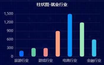
let box7 = document.getElementById(‘box7‘)
    let myEcharts = echarts.init(box7)

    let option = {
      color: [‘#006cff‘, ‘#60cda0‘, ‘#ed8884‘, ‘#ff9f7f‘, ‘#0096ff‘, ‘#9fe6b8‘, ‘#32c5e9‘, ‘#1d9dff‘],
      title: {
        text: ‘柱状图-就业行业‘,
        left: ‘center‘,
        textStyle: {
          color: ‘#fff‘,
          fontSize: 14,
          fontWeight: 400
        }
      },
      tooltip: {
        show: true,
        trigger: ‘axis‘,
        axisPointer: {
          type: ‘shadow‘
        }

      },

      grid: {
        left: "4%",
        top: "20%",
        right: "4%",
        bottom: "4%",
        containLabel: true
      },
      xAxis: {
        type: ‘category‘,
        axisLine: {
          show: false
        },
        axisTick: {
          show: false
        },
        axisLabel: {
          color: "rgba(255,255,255,.6)",
          fontSize: "12"
        },
        data: ["旅游行业",
          "教育培训",
          "游戏行业",
          "医疗行业",
          "电商行业",
          "社交行业",
          "金融行业"]
      },
      yAxis: {
        axisLine: {
          show: true,
          lineStyle: { color: ‘rgba(255,255,255,.1)‘ }
        },
        axisTick: {
          show: true
        },
        axisLabel: {
          color: "rgba(255,255,255,.6)",
          fontSize: "12"
        },
        splitLine: {
          lineStyle: {
            color: ‘rgba(255,255,255,.1)‘
          }
        }
      },
      series: [{
        name: ‘2019‘,
        type: ‘bar‘,
        barWidth: ‘35%‘, //
        itemStyle: {
          barBorderRadius: 5,
          color: function (params) {

            return option.color[params.dataIndex]
          }


        },
        data: [200, 300, 300, 900, 1500, 1200, 600],
      }]
    };
    myEcharts.setOption(option)
原文:https://www.cnblogs.com/xiaoliziaaa/p/13228517.html