为了更好的去理解所有基础绘图功能,我们通过天气温度变化的绘图来融合所有的基础API使用
matplotlib.pytplot包含了一系列类似于matlab的画图函数。 它的函数作用于当前图形(figure)的当前坐标系(axes)。
import matplotlib.pyplot as plt
plt.figure(figsize=(10, 10))
x = [1, 2, 3, 4, 5, 6 ,7]    # 周一到周末
y = [17,17,18,15,11,11,13]   # 对应的天气
plt.plot(x,y )
plt.show()
# 语法介绍
# plt.figure(figsize=(), dpi=)
# figsize:指定图的长宽
# dpi:图像的清晰度
# 返回fig对象
# plt.savefig(path)

plt.figure(figsize=(20, 8), dpi=80)
plt.savefig("test.png")
# 画出温度变化图
# 创建一个figure
plt.figure(figsize=(20, 8), dpi=80)

# 准备x, y坐标的数据
x = range(60)
y_shanghai = [random.uniform(15, 18) for i in x]

# 画折线图
plt.plot(x, y_shanghai, label="上海")

plt.show()
plt.xticks(x, **kwargs)
x:要显示的刻度值
plt.yticks(y, **kwargs)
y:要显示的刻度值
# 增加以下两行代码
# 构造中文列表的字符串
x_ch = ["11点{}分".format(i) for i in x]
y_ticks = range(40)

# 修改x,y坐标的刻度
plt.xticks(x[::5], x_ch[::5])
plt.yticks(y_ticks[::5])
plt.xlabel("时间")
plt.ylabel("温度")
plt.title("中午11点0分到12点之间的温度变化图示")
# 生成北京的温度
y_beijing = [random.uniform(1, 3) for i in x]

# 画折线图 1
plt.plot(x, y_shanghai, label="上海")
# 使用plot可以多次画多个折线
plt.plot(x, y_beijing, color=‘r‘, linestyle=‘--‘, label="北京")
# 添加图形注释
plt.legend(loc="best")
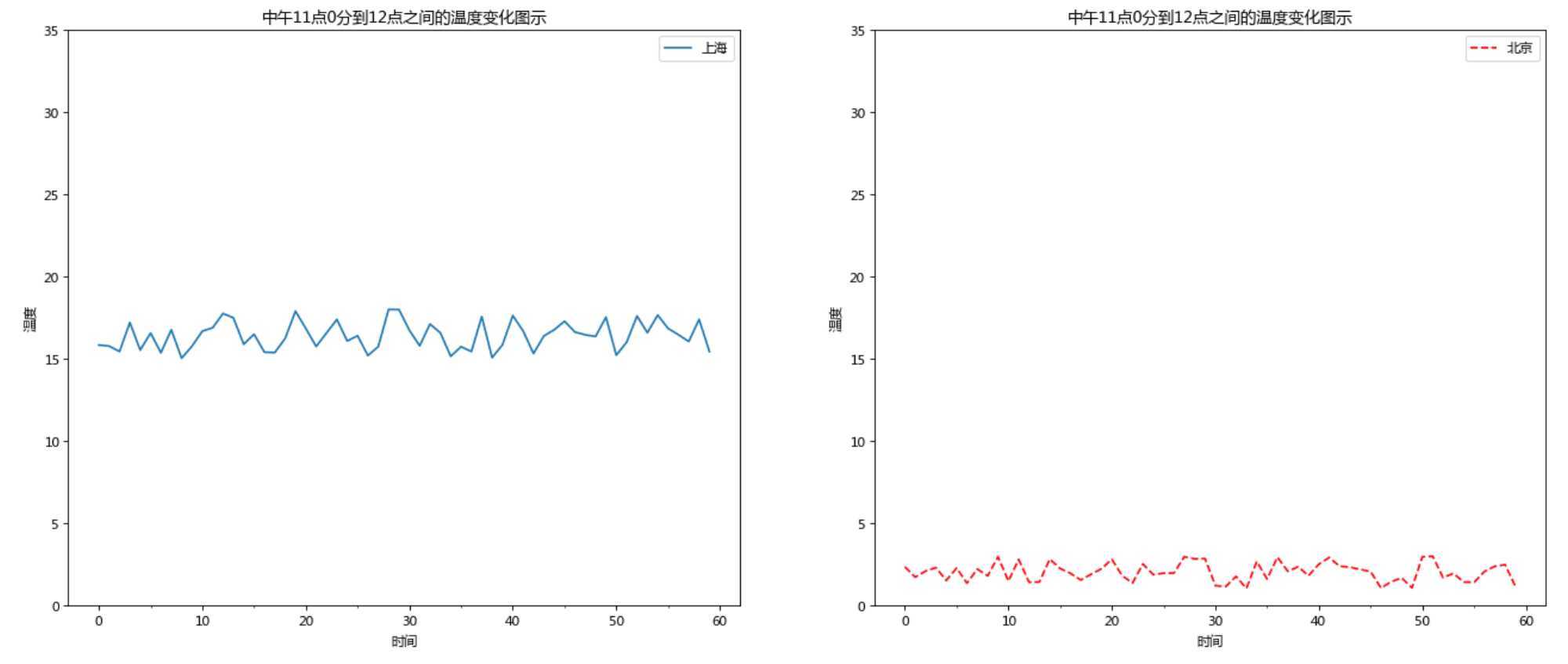
如果我们想要将上海和北京的天气图显示在同一个图的不同坐标系当中,效果如下:
可以通过subplots函数实现(旧的版本中有subplot,使用起来不方便),推荐subplots函数
# matplotlib.pyplot.subplots(nrows=1, ncols=1, **fig_kw) 创建一个带有多个坐标系的图

# Parameters:

# nrows, ncols : int, optional, default: 1, Number of rows/columns of the subplot grid.
# **fig_kw : All additional keyword arguments are passed to the figure() call.

# Returns:
# fig : 图对象
# ax :
    # 设置标题等方法不同:
    # set_xticks
    # set_yticks
    # set_xlabel
    # set_ylabel
关于axes子坐标系的更多方法:参考https://matplotlib.org/api/axes_api.html#matplotlib.axes.Axes
# 画出温度变化图,展现在不同axes里面
# 创建一个figure
fig, axes = plt.subplots(nrows=1, ncols=2, figsize=(20, 8), dpi=80)

# 准备x, y坐标的数据
x = range(60)
# y的刻度范围
y_ticks = range(40)
y_shanghai = [random.uniform(15, 18) for i in x]

# 生成北京的温度
y_beijing = [random.uniform(1, 3) for i in x]

# 构造中文列表的字符串
x_ch = ["11点{}分".format(i) for i in x]

# 画折线图
axes[0].plot(x, y_shanghai, label="上海")
# 使用plot可以多次画多个折线
axes[1].plot(x, y_beijing, color=‘r‘, linestyle=‘--‘, label="北京")


# 美化x,y的刻度值
# 第一个参数必须是刻度数字类型,第二个是对应着第一个数字的中文描述
axes[0].set_xticks(x[::5], x_ch[::5])
axes[0].set_yticks(y_ticks[::5])

axes[1].set_xticks(x[::5], x_ch[::5])
axes[1].set_yticks(y_ticks[::5])

# 增加x,y描述信息和标题信息
axes[0].set_xlabel("时间")
axes[0].set_ylabel("温度")

axes[1].set_xlabel("时间")
axes[1].set_ylabel("温度")

axes[0].set_title("中午11点0分到12点之间的温度变化图示")
axes[1].set_title("中午11点0分到12点之间的温度变化图示")

axes[0].legend(loc="best")
axes[1].legend(loc="best")

plt.show()
python 使用matplotlib.pytplot.plot绘制 折线图
原文:https://www.cnblogs.com/caijunchao/p/13281317.html