#网址:https://echarts.apache.org/examples/zh/index.html
#网址:https://www.cnblogs.com/hustcser/p/8831176.html 和 https://blog.csdn.net/u012535605/article/details/80677791
#版本:pip install pyecharts==0.5.5
#参数
# https://blog.csdn.net/weixin_43746433/article/details/97766914?utm_medium=distribute.pc_relevant.none-task-blog-baidujs-1
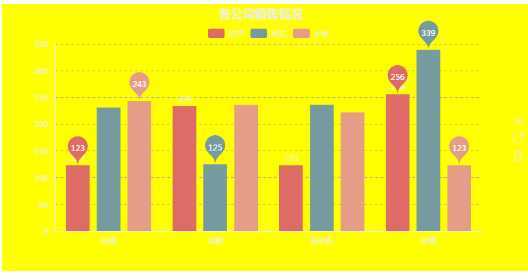
1、柱状图
form pyecharts import Bar
x=["电视","冰箱","洗衣机","空调"]
a=[123,234,123,256]
b=[231,125,236,339]
c=[243,236,222,123]

bar=Bar("各分公司销售数据",title_pos="40%",background_color="yellow")#title_pos标题的位置,background_color背景颜色,title_color标题字体颜色

bar.use_theme("dark")#设置图表的主题
bar.add("苏宁",x,a,mark_point= ["max","min"],legend_top ="8%",is_label_show= True)#显示最大值和最小值,legend_top图列标题的位置,is_label_show显示数据标签

bar.add("京东",x,b,mark_point= ["max","min"],legend_top ="8%")#label_color=[‘yellow‘]柱的颜色

bar.add("小米",x,c,mark_point= ["max","min"],legend_top ="8%")#显示最大值和最小值,legend_top图列的位置

bar.render("D:\My Documents\Desktop\shashs.html")
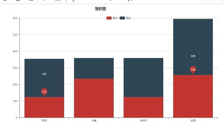
2、堆积图
bar=Bar ("堆积图",title_pos= "40%",width= 1200,height= 600)#title_pos标题名称的位置,width图表的长度,height图表的宽度
bar.add("苏宁",x,a,legend_top= "8%",mark_point= ["max","min"],is_stack= True )#is_stack=True是否是堆积

bar.add("京东",x,b,legend_top= "8%",mark_point= ["max","min"],is_stack= True )

bar.render("D:\My Documents\Desktop\shashs.html")
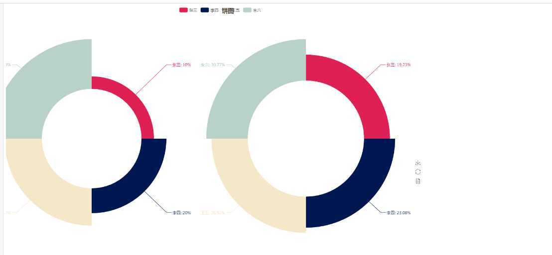
3、饼图
from  pyecharts import Pie

a=[1,2,3,4]

b=[5,6,7,8]

c=[2,3,4,5]

x=["张三","李四","王五","朱六"]

pie=Pie (‘饼图‘,title_pos ="50%",width= 1290,height= 1000)#background_color背景颜色,title_color标题字体颜色

pie.use_theme("roma")

pie.add(‘商品A‘,x,a,radius= [30,60],rosetype="area", center=[20,40],is_label_show= True)#radius= [30,75]表示是一个环形,分别是内径好外径,rosetype="area"表示是一个玫瑰样式的图形,is_label_show是显示标签及比例,center=[20,40]表示该图形的位置
pie.add("商品B",x,b,radius= [35,60],center= [70,40],rosetype="area",is_label_show= True )#center表示图表在的位置,,label_color= ["yellow",‘green‘]设置各部分的颜色,必须加中括号

pie.render("D:\My Documents\Desktop\shashs.html")
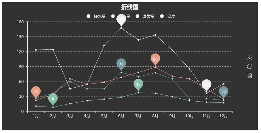
4、折线图

from pyecharts import Line
sttr=["{}月".format(i) for i in range(1,13) ]

v1=[123,124,45,54,132,167,143,153,122,85,36,55]#降水量

v2=[26,36,59,45,45,78,69,77,65,24,25,22]#流失量

v3=[22,33,65,54,58,68,78,88,70,65,45,24]#蒸发量

v4=[10,8,15,21,24,28,37,36,29,21,18,17]#温度

line=Line ("折线图",title_pos=‘center‘)#折线图是图表的名字,title_pos标题放的位置,title_top="50%"是在上下的一半

line.use_theme("dark")

line.add("降水量",sttr ,v1,mark_point= ["max","min"],legend_top ="8%",label_color= ["r"])#legend_top是各标签的位置,labei_color是各图表的颜色

line.add("流失量",sttr ,v2,mark_point= ["max","min"],legend_top ="8%",label_color= ["r"])

line.add("蒸发量",sttr ,v3,mark_point= ["max","min"],legend_top ="8%",label_color= ["r"])

line.add("温度",sttr ,v4,mark_point= ["max","min"],legend_top ="8%",label_color= ["r"])

line.render("D:\My Documents\Desktop\shashs.html")
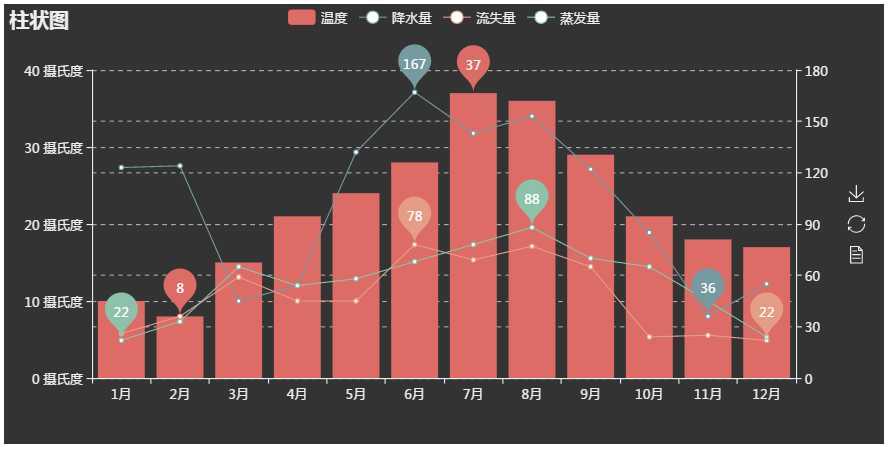
5、将柱状图和折线图合并在一个图
from pyecharts import Line,Overlap

from pyecharts import Bar

sttr=["{}月".format(i) for i in range(1,13) ]

v1=[123,124,45,54,132,167,143,153,122,85,36,55]#降水量

v2=[26,36,59,45,45,78,69,77,65,24,25,22]#流失量

v3=[22,33,65,54,58,68,78,88,70,65,45,24]#蒸发量

v4=[10,8,15,21,24,28,37,36,29,21,18,17]#温度

line=Line ("折线图")

line .use_theme(‘dark‘)

line.add("降水量",sttr,v1,mark_point= ["max","min"] )#is_label_show= True打印所有数据

line.add("流失量",sttr ,v2,mark_point= ["max","min"])#只打印最大值和最小值

line.add("蒸发量",sttr ,v3,mark_point= ["max","min"])

# line.add("温度",sttr ,v4,is_label_show= True,yaxis_formatter= "°C")# yaxis_formatter= "°C"定义y轴的单位

bar=Bar("柱状图")

bar.use_theme(‘dark‘)

bar.add("温度",sttr ,v4,mark_point= ["max","min"],yaxis_formatter= "摄氏度")# yaxis_formatter= "°C"定义y轴的单位

ove=Overlap ()

ove.use_theme(‘dark‘)

ove.add(bar)

ove.add(line,is_add_yaxis= True,yaxis_index=1 )#is_add_yaxis= True,yaxis_index=1:增加新的坐标轴,这两个都得写上

ove.render("D:\My Documents\Desktop\shashs.html")
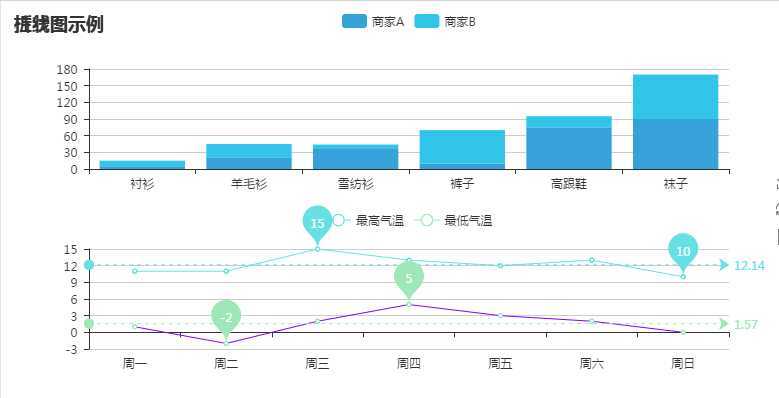
6、多个图形展示同一页面
from pyecharts import Bar, Line,Overlap,Grid

attr = ["衬衫", "羊毛衫", "雪纺衫", "裤子", "高跟鞋", "袜子"]

v1 = [5, 20, 36, 10, 75, 90]

v2 = [10, 25, 8, 60, 20, 80]

bar = Bar("柱状图示例",height=1000)

bar.use_theme(‘shine‘)

bar.add("商家A", attr, v1, is_stack=True)

bar.add("商家B", attr, v2, is_stack=True)

line = Line("折线图示例", height=1000)

attr = ["周一", "周二", "周三", "周四", "周五", "周六", "周日"]
line.add(

    "最高气温",

    attr,

    [11, 11, 15, 13, 12, 13, 10],

    mark_point=["max", "min"],

    mark_line=["average"],

)

line.add(

    "最低气温",

    attr,

    [1, -2, 2, 5, 3, 2, 0],

    mark_point=["max", "min"],

    mark_line=["average"],

    legend_top="50%",

    line_color=‘#8000ff‘

)

grid = Grid()

grid.add(bar, grid_bottom="60%")

grid.add(line, grid_top="60%")

grid.render(‘D:\My Documents\Desktop\dark.html‘)
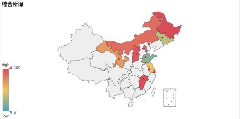
7、地图
#需安装一下库

pip install echarts-countries-pypkg

pip install echarts-china-provinces-pypkg

pip install echarts-china-cities-pypkg

pip install echarts-china-counties-pypkg

pip install echarts-china-misc-pypkg

pip install echarts-united-kingdom-pypkg
from pyecharts import Map
dizhi=["山东","江苏","上海","吉林","江西","内蒙古","甘肃","黑龙江","山西","北京","天津"]

values=[18,52,125,36,142,87,69,110,97,87,10]

geo=Map  ("综合所得")#定义长宽:width= 1200,height= 600

geo .add("",dizhi,values ,maptype= "china",is_visualmap=True, visual_text_color=‘#000‘)#is_visualmap:视觉图

geo.render(‘D:\My Documents\Desktop\dark.html‘)
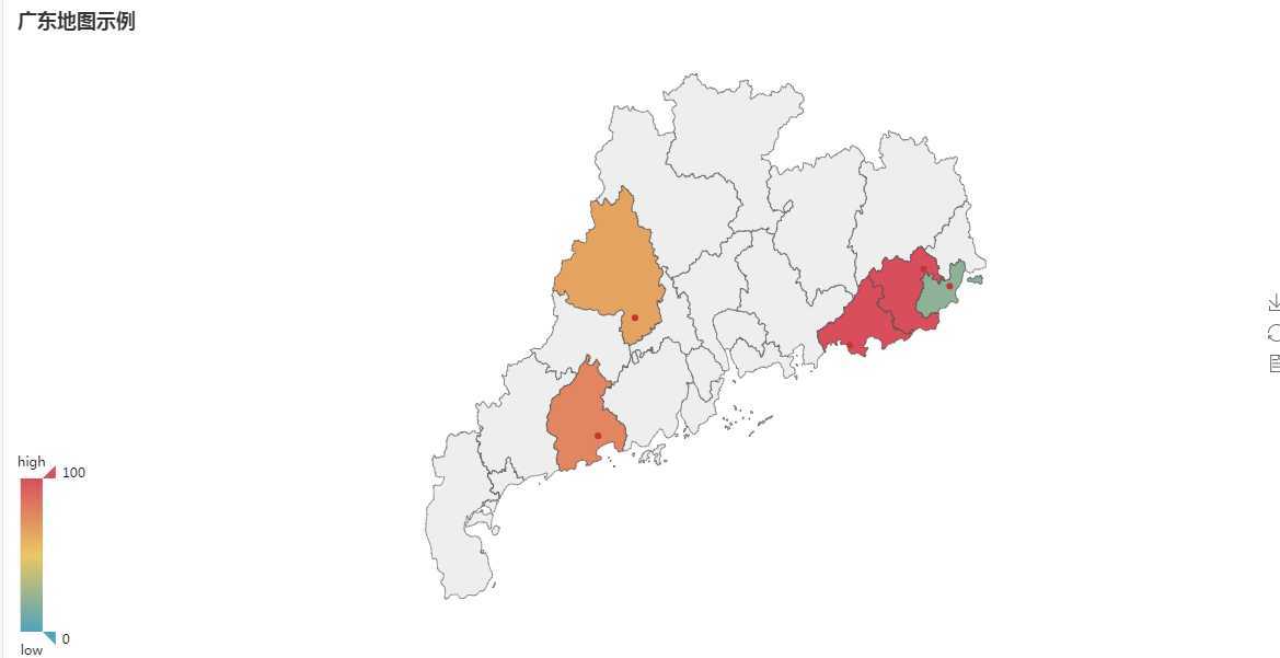
8、地图(二)
from pyecharts import Map

value =[20, 190, 253, 77, 65]

attr =[‘汕头市‘, ‘汕尾市‘, ‘揭阳市‘, ‘阳江市‘, ‘肇庆市‘]

map=Map("广东地图示例", width=1200, height=600)

map.add("", attr, value, maptype=‘广东‘, is_visualmap=True, visual_text_color=‘#000‘)#maptype 是标注那个省,is_visualmap是否显示视觉图

map.show_config()

map.render()
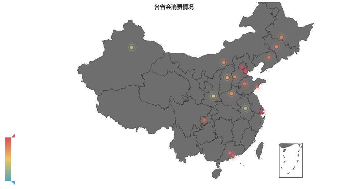
9、地图三(geo)
from pyecharts import Geo

chengshi=["北京","上海","天津","重庆","广州","深圳","济南","青岛","哈尔滨","长春","沈阳","呼和浩特","石家庄","乌鲁木齐","太原","西安","郑州","合肥"]

values=[123,124,99,89,88,92,84,90,78,76,84,76,78,35,65,44,72,32]

geo=Geo ("各省会消费情况",title_pos= "40%",width= 1200,height= 600)
geo.add("",chengshi ,values ,type="effectScatter",  visual_text_color="#fff", #在外面加动态圆环

        is_visualmap=True,  symbol_size=8, effect_scale=5)#symbol_size=8, effect_scale=5是确定圆圈的大小
geo .render(‘D:\My Documents\Desktop\dark.html‘)
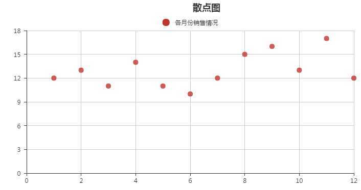
10、散点图
a=[1,2,3,4,5,6,7,8,9,10,11,12 ]

v1=[12,13,11,14,11,10,12,15,16,13,17,12]

sactter=Scatter ("散点图",title_pos= "50%")

sactter.add("各月份销售情况",a,v1,effect_scale= 5,legend_top ="8%")

sactter .render(‘D:\My Documents\Desktop\dark.html‘)
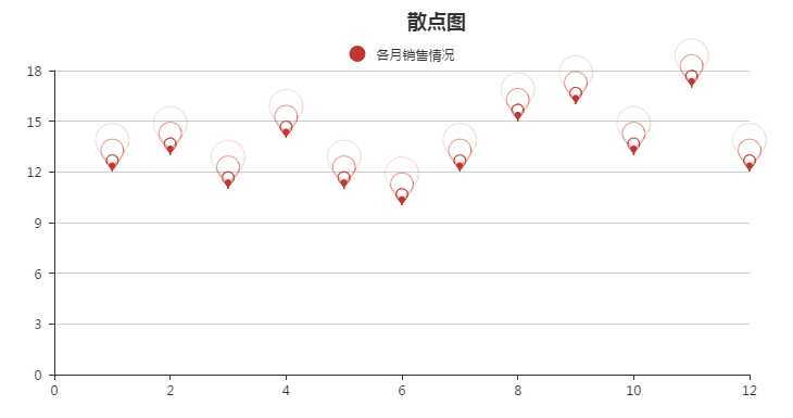
11、动态散点图
from pyecharts import Scatter ,EffectScatter,Overlap,WordCloud
a=[1,2,3,4,5,6,7,8,9,10,11,12 ]

v1=[12,13,11,14,11,10,12,15,16,13,17,12]

es=EffectScatter("散点图",title_pos= "50%")

es.add("各月销售情况",a,v1,legend_top ="8%",effect_scale=6,symbol=‘pin‘ )#effect_scale:调整动态的大小的,symbol:样式("rect","pin","roundRect","diamond","arrow","triangle")

es.render(‘D:\My Documents\Desktop\dark.html‘)
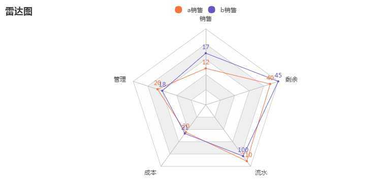
12、雷达图
from pyecharts import Radar,Overlap

rad=[("销售",25),("管理",30),("成本",45),("流水",120),("剩余",45)]

a=[[12,20,20,110,40]]

b=[[17,18,21,100,45]]

radar=Radar ("雷达图")

radar .config(rad )

radar .add("a销售",a,item_color="#f9713c",is_label_show= True )#item_color图形的颜色,is_label_show= True显示标签数值

radar .add("b销售",b,item_color=‘#6258c4‘,is_label_show= True)#item_color图形的颜色

radar .render(‘D:\My Documents\Desktop\dark.html‘)
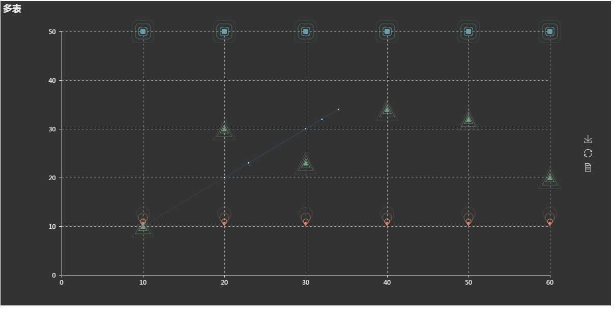
12、自定义图形overlap:在一个图形中融合折线图和动态散点图
v1 = [10, 20, 30, 40, 50, 60]

v2 = [30, 30, 30, 30, 30, 30]

v3 = [50, 50, 50, 50, 50, 50]

v4 = [10, 10, 10, 10, 10, 10]

v5=[10,30,23,34,32,20]

line=Line ()

line.add("",[10, 20, 30, 40, 50, 60],[10,30,23,34,32,20])#在这里加折线图时要去网页改这部分数据,要然报错

sce=Scatter ("多表")

sce.add("",v1,v3)

es=EffectScatter ()

es.add("",v1,v3,symbol="roundRect",effect_scale=5)

es1=EffectScatter ()

es1.add("",v1,v4,symbol=‘pin‘,effect_scale=5 )

es1.add("",v1,v5,symbol= "triangle",effect_scale=5)

ove=Overlap (width= 1200,height= 600)

ove.use_theme("dark")

ove.add(sce )

ove.add(line )

ove.add(es)

ove.add(es1)

ove.render(‘D:\My Documents\Desktop\dark.html‘)
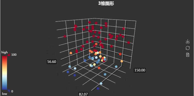
13、3维图形
from pyecharts import Scatter3D ,Bar,Page

import numpy as  np

data=[[np.random .randint(0,100),np.random .randint(0,150),np.random .randint(0,200)] for _ in range (80)  ]

range_color = [

    ‘#313695‘, ‘#4575b4‘, ‘#74add1‘, ‘#abd9e9‘, ‘#e0f3f8‘, ‘#ffffbf‘,

    ‘#fee090‘, ‘#fdae61‘, ‘#f46d43‘, ‘#d73027‘, ‘#a50026‘]

sca=Scatter3D ("3维图形",title_pos= "50%")#3维图形

sca.use_theme("dark")

sca .add("",data,is_visualmap= True ,visual_range_color=range_color)#is_visualmap既图片左下角的筛选按钮,不加上,后面的颜色也修改不了,visual_range_color是颜色的颜色
sca.render()
原文:https://www.cnblogs.com/pannizhe123900402/p/13292489.html