npm install echarts --save
import echarts from ‘echarts‘
Vue.prototype.$echarts = echarts
<div id="map" style="width: 100%;height:326px;"></div>
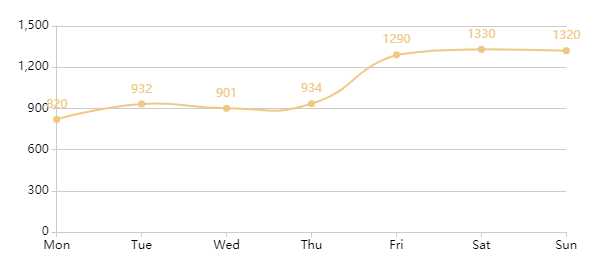
 getMap() {
      var myChart = this.$echarts.init(document.getElementById(‘map‘))
      let option = {
        xAxis: {
          type: ‘category‘,
          // data: this.dataX,
          data: [‘Mon‘, ‘Tue‘, ‘Wed‘, ‘Thu‘, ‘Fri‘, ‘Sat‘, ‘Sun‘],
          boundaryGap: false, //控制日期是否在中间显示
          axisLabel: {
            show: true, //是否显示日期
            interval: 0, //强制显示全部 // rotate: 40,//倾斜的角度
            textStyle: {
              color: ‘#000‘, //日期的颜色
              fontSize: 12 //字体的大小
            }
          },
          axisLine: {
            lineStyle: {
              color: ‘#ccc‘ // x轴的颜色
            }
          }
        },
        yAxis: {
          type: ‘value‘,
          axisLabel: {
            formatter: ‘{value}‘,
            textStyle: {
              color: ‘#000‘ //数字的颜色
            },
            inside: false //控制数据是否在内侧还是外侧显示
          },
          axisLine: {
            lineStyle: {
              color: ‘#ccc‘ // 折线的颜色
            }
          }
        },
        series: [
          {
            // data: this.dataY,
            data: [820, 932, 901, 934, 1290, 1330, 1320],
            type: ‘line‘,
            symbol: ‘circle‘, //是否显示实心的折线圆点
            smooth: true, //让折线有弧度
            symbolSize: 7, //折线圆点的大小
            itemStyle: {
              normal: {
                color: ‘#efc883‘, //折线点的颜色
                lineStyle: {
                  color: ‘#efc883‘ //折线的颜色
                },
                label: { show: true } //是否在折线点上显示数字
              }
            }
          }
        ]
      }
      myChart.setOption(option)
    }
原文:https://www.cnblogs.com/wu-hen/p/13696042.html