简单的例子:
import matplotlib.pyplot as plt
plt.plot([1,2,3,4])
plt.show()
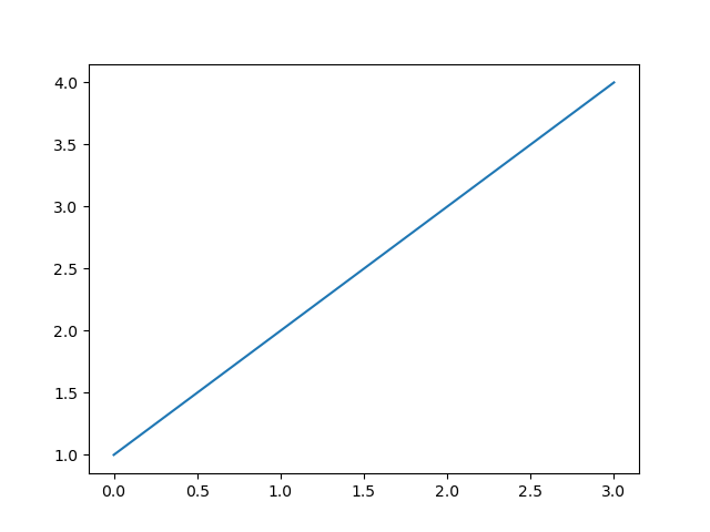
你可能会好奇为什么x轴范围是[0,3],y轴范围是[1,4],因为若提供给plot一个单独的list或array,matplotlib会认为这是y轴上的取值,并会自动生成x轴上的取值。因为python默认取值从0开始,所以生成的和y取值序列同样长度的x序列是[0,1,2,3]。
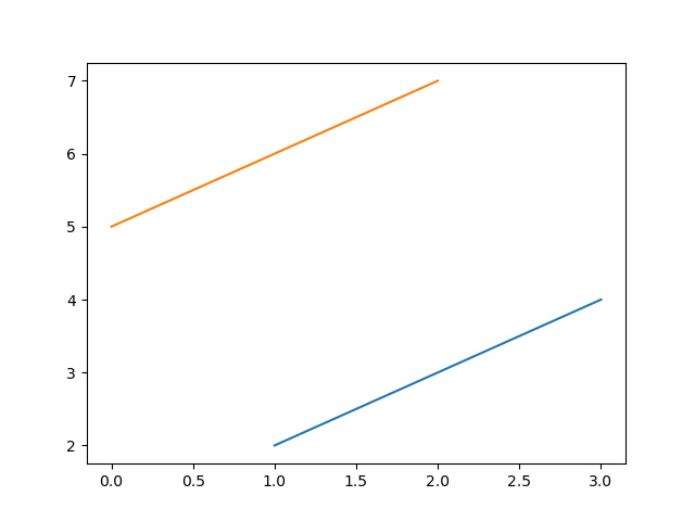
plot是一个灵活的函数,你可以写任意数量的参数,例如:
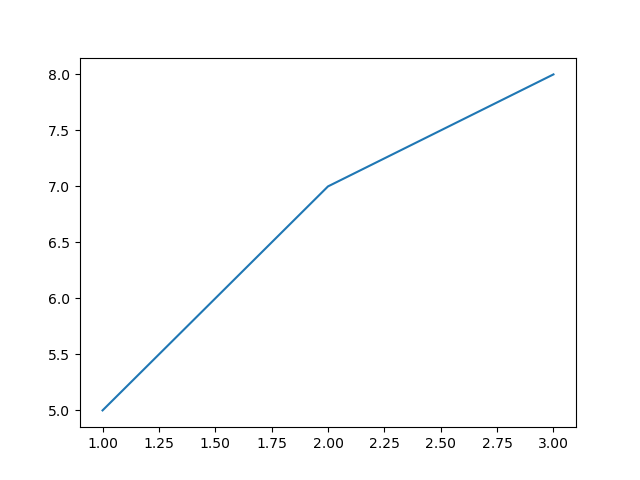
plt.plot([1,2,3],[2,3,4],[5,6,7])

plt.plot([1,2,3],[5,7,8])
对于每一个x,y参数对序列,有第三个可选的string格式参数fmt用于描述该plot的颜色和线的类型,该字符串格式中的字母和符号来源于MATLAB,是颜色字符串和线型字符串的组合,默认为‘b-‘,即蓝色实线。
fmt=‘[marker][line][color]‘
marker表示点,line表示线,color表示颜色
| character | description |
|---|---|
| ‘.‘ | point marker |
| ‘,‘ | pixel marker |
| ‘o‘ | circle marker |
| ‘v‘ | triangle_down marker |
| ‘^‘ | triangle_up marker |
| ‘<‘ | triangle_left marker |
| ‘>‘ | triangle_right marker |
| ‘1‘ | tri_down marker |
| ‘2‘ | tri_up marker |
| ‘3‘ | tri_left marker |
| ‘4‘ | tri_right marker |
| ‘s‘ | square marker |
| ‘p‘ | pentagon marker |
| ‘*‘ | star marker |
| ‘h‘ | hexagon1 marker |
| ‘H‘ | hexagon2 marker |
| ‘+‘ | plus marker |
| ‘x‘ | x marker |
| ‘D‘ | diamond marker |
| ‘d‘ | thin_diamond marker |
| ‘ | ‘ |
| ‘_‘ | hline marker |
| character | description |
|---|---|
| ‘-‘ | solid line style |
| ‘--‘ | dashed line style |
| ‘-.‘ | dash-dot line style |
| ‘:‘ | dotted line style |
| character | color |
|---|---|
| ‘b‘ | blue |
| ‘g‘ | green |
| ‘r‘ | red |
| ‘c‘ | cyan |
| ‘m‘ | magenta |
| ‘y‘ | yellow |
| ‘k‘ | black |
| ‘w‘ | white |
示例:
>>>plt.plot([1,3,5],[2,4,6],‘ro‘)
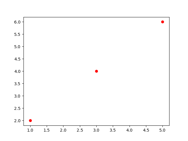
查看plot获得完整的线型说明;
matplotlib不仅限于使用list,通常我们使用numpy arrays,实际上,在内部所有序列都会被转换为numpy arrays。
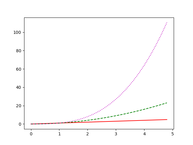
示例:
t=np.arange(0,5,0.2)
plt.plot(t,t,‘r-‘,t,t**2,‘g--‘,t,t**3,‘m:‘)
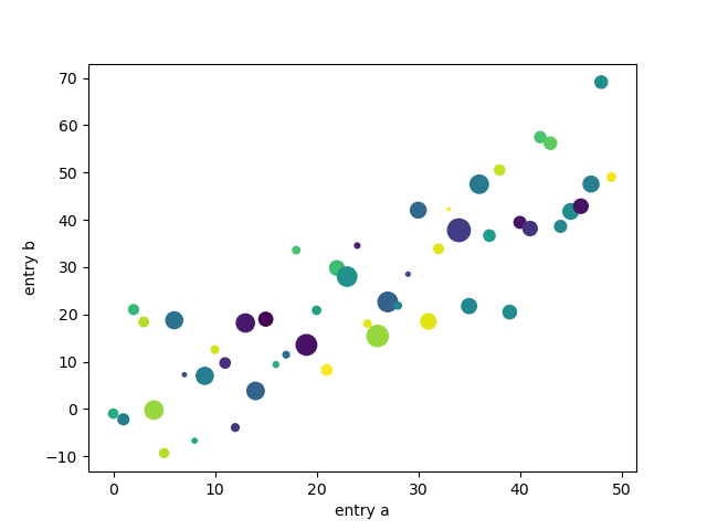
当我们使用numpy.recarray或pandas.DataFrame之类的数据时,matplotlib允许我们给此类对象提供data关键字参数,可以使用这些变量对应的字符串生成相应的图。
示例:
data = {‘a‘: np.arange(50),
        ‘c‘: np.random.randint(0, 50, 50),
        ‘d‘: np.random.randn(50)}
data[‘b‘] = data[‘a‘] + 10 * np.random.randn(50)
data[‘d‘] = np.abs(data[‘d‘]) * 100

plt.scatter(‘a‘, ‘b‘, c=‘c‘, s=‘d‘, data=data)
plt.xlabel(‘entry a‘)
plt.ylabel(‘entry b‘)
plt.show()
原文:https://www.cnblogs.com/ShineMiao/p/14017336.html