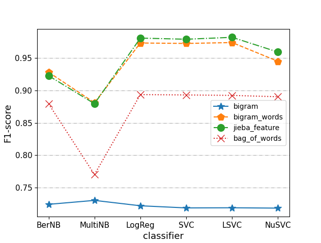
import matplotlib.pyplot as plt
import numpy as np
import pandas as pd


#输入因变量

y1 = [0.724266, 0.730357, 0.722058, 0.718748, 0.718975, 0.718422]
y2 = [0.922546, 0.87944, 0.980582, 0.978843, 0.981803, 0.959068]
y3 = [0.927972, 0.880988, 0.973044, 0.972353, 0.973717, 0.944803]
y4 = [0.879261, 0.770276, 0.893485, 0.892955, 0.892227, 0.890149]
#assert y1.shape[0]==y2.shape[0], ‘两个因变量个数不相等!‘

fig,ax=plt.subplots(figsize=(6.4,4.8), dpi=100)
#设置自变量的范围和个数
x = ["BerNB", "MultiNB", "LogReg", "SVC" ,"LSVC", "NuSVC"]
#画图
ax.plot(x,y1, label=‘bigram‘, linestyle=‘-‘, marker=‘*‘,  markersize=‘10‘)
ax.plot(x,y3, label=‘bigram_words‘, linestyle=‘--‘, marker=‘p‘, markersize=‘10‘)
ax.plot(x,y2, label=‘jieba_feature‘, linestyle=‘-.‘, marker=‘o‘, markersize=‘10‘)
ax.plot(x,y4, label=‘bag_of_words‘, linestyle=‘:‘, marker=‘x‘, markersize=‘10‘)
#设置坐标轴
#ax.set_xlim(0, 9.5)
#ax.set_ylim(0, 1.4)
ax.set_xlabel(‘classifier‘, fontsize=13)
ax.set_ylabel(‘F1-score‘, fontsize=13)
#设置刻度
ax.tick_params(axis=‘both‘, labelsize=11)
#显示网格
#ax.grid(True, linestyle=‘-.‘)
ax.yaxis.grid(True, linestyle=‘-.‘)
#添加图例
legend = ax.legend(loc=‘best‘)

plt.show()
fig.savefig(‘res/pic/1.png‘)
参数说明:
linestyle线的种类:
marker参数在折线上打标记:
线条透明度选项:
参考文献
1. https://blog.csdn.net/qq_26697045/article/details/8901862
原文:https://www.cnblogs.com/z-712/p/14179499.html