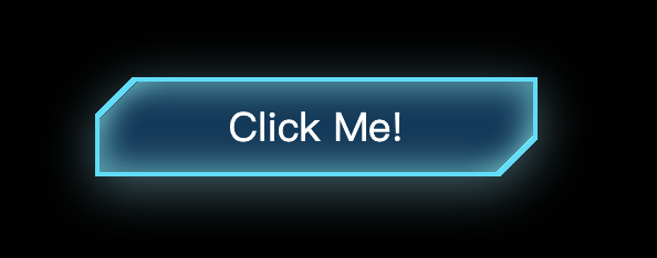
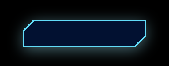
如果有一天,UI设计师丢过来一张UI稿,上面有这样一个带有斜切角、有边框还有内外阴影的按钮,你会怎么实现呢?第一反应切图?可是按钮内容、大小都是可变的,那得切多少图啊~Canvas?SVG?No,no,no,今天我们用css手撸这个花里胡哨的按钮。
做之前我们先分析一下实现过程中的难点:
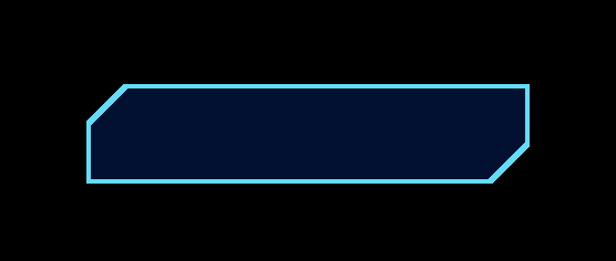
首先我们来实现按钮的主体和边框,说一下实现思路,css可以通过背景渐变实现斜切角的样式,但是这个时候边框就没办法直接用border实现了,只能用两个盒子模拟边框,即小盒子嵌套在大盒子上面,大盒子露出来的部分就是小盒子的边框。让我们看一下代码
<div class="outer">
    <div class="inner"></div>
</div>
.outer{
    display: flex;
    align-items: center;
    justify-content: center;
    width: 200px;
    height: 45px;
    background: linear-gradient(-45deg, transparent 12px, #5bdcfa 0) right,
                 linear-gradient(135deg, transparent 12px, #5bdcfa 0) left;
    background-size: 50% 100%;
    background-repeat: no-repeat;
}
.inner{
    width: calc(100% - 4px);
    height: calc(100% - 4px);
    background: linear-gradient(-45deg, transparent 12px, #011032 0) right,
        		 linear-gradient(135deg, transparent 12px, #011032 0) left;
    background-size: 50% 100%;
    background-repeat: no-repeat;
}
这个时候的效果是这样的:
说一下上面的代码:
切角的实现:
background: linear-gradient(-45deg, transparent 12px, #5bdcfa 0) right,
			linear-gradient(135deg, transparent 12px, #5bdcfa 0) left;
background-size: 50% 100%;
background-repeat: no-repeat;
linear-gradient(-45deg, transparent 12px, #5bdcfa 0) right
这一行代码是生成左上角的切角的,即以-45度的倾斜角度,x轴12px的位置开始从transparent到#5bdcfa的渐变,生成右下角的同理。
那为什么要设置background-size: 50% 100%;呢?因为我们写了两遍渐变,相当于你给墙上刷油漆刷了两遍,会覆盖的,所以我们就是每一遍只刷50%的宽度,一左一右。
如果两边颜色不同就像上图一样,很好理解,no-repeat是因为我们一边只要一个切角就够了。
边框
边框的实现就很简单了,大盒子套小盒子嘛。
这样看来我们只要加个内外阴影就完成了,看起来也不是很难嘛~如果你这样想就是是too young了。
外阴影
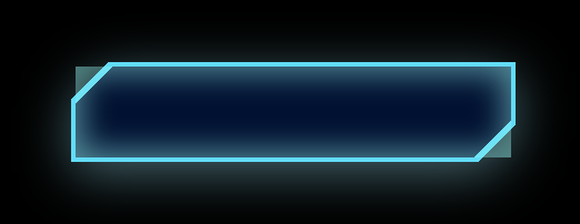
按我们常规的想法,直接给outer容器加个box-shadow:0 5px 12px rgba(149, 224, 242, 0.45),完事~看下效果:
完犊子,左上角和右下角露馅儿了,此路不通啊。别急,给你看个宝贝:filter: drop-shadow(0 5px 12px rgba(149, 224, 242, 0.45));。再看看:
完美!关于drop-shadow,推荐你看看张鑫旭的文章:CSS3 filter:drop-shadow滤镜与box-shadow区别应用。
内阴影
内阴影我们也直接给inner容器加box-shadow试试看,box-shadow: inset 0 0 14px 3px rgba(146, 244, 243, 0.55);
老毛病了,那你该说了,上drop-shadow啊,对不起,那玩意儿不支持内阴影。这时候我们就想了,如果把两个角“切”掉就好了,那css有这个功能吗?还真有:clip-path。看一下MDN的描述:
clip-pathCSS 属性使用裁剪方式创建元素的可显示区域。区域内的部分显示,区域外的隐藏。
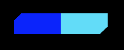
这玩意怎么用呢?它(polygon)是用一个个的坐标点圈一块区域,如下Demo:
<div class="outer">
	<div class="inner"></div>
</div>
.outer,.inner { width: 200px;height: 200px; }
.outer { background-color: red; }
.inner {
    background-color: blue;
    clip-path: polygon(
        10px 10px,
        100px 10px,
        100px 100px,
        10px 100px
    );
}
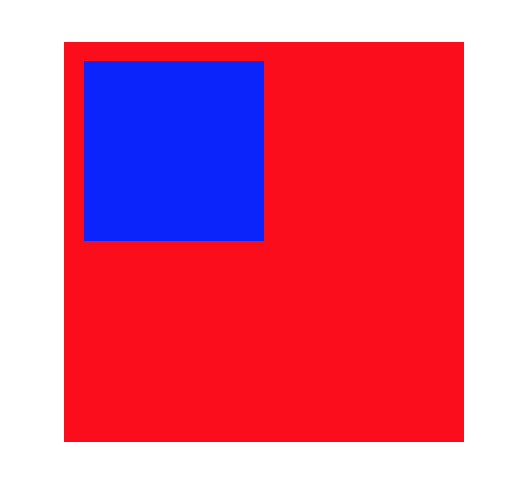
蓝色的色块就是我们用clip-path圈出来的区域。
现在我们把inner容器“有用的”区域圈出来:
clip-path: polygon(
    0 17px,
    17px 0,
    100% 0,
    100% calc(100% - 17px),
    calc(100% - 17px) 100%,
    0 100%
)
效果如下:
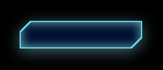
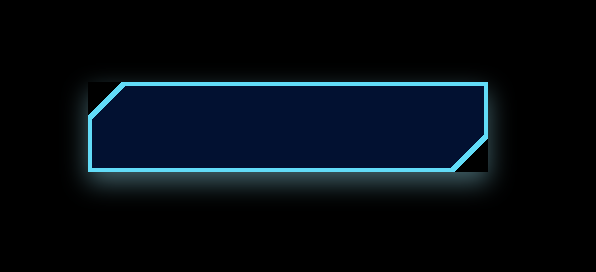
如果你要求不高,其实现在效果已经差不多了,唯一一点瑕疵就是左上角和右下角的内阴影被切掉了,所以这两块的内阴影有些淡,我们可以用两个盒子的来模拟:
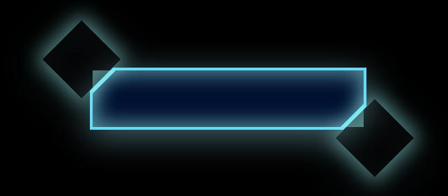
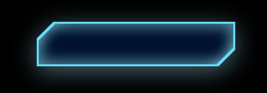
上面是没有clip-path的效果,加上后的最终效果:
最后附上Demo源码:
<!DOCTYPE html>
<html lang="en">
    <head>
        <meta charset="UTF-8" />
        <meta name="viewport" content="width=device-width, initial-scale=1.0" />
        <title>Document</title>
    </head>
    <style>
        html,
        body {
            width: 100%;
            height: 100%;
            display: flex;
            align-items: center;
            justify-content: center;
            background-color: black;
        }
        .outer {
            display: flex;
            align-items: center;
            justify-content: center;
            width: 200px;
            height: 45px;
            background: linear-gradient(-45deg, transparent 12px, #5bdcfa 0)
                    right,
                linear-gradient(135deg, transparent 12px, #5bdcfa 0) left;
            background-size: 50% 100%;
            background-repeat: no-repeat;
            filter: drop-shadow(0 5px 12px rgba(149, 224, 242, 0.45));
        }
        .inner {
            position: relative;
            display: flex;
            align-items: center;
            justify-content: center;
            width: calc(100% - 4px);
            height: calc(100% - 4px);
            background: linear-gradient(-45deg, transparent 12px, #011032 0)
                    right,
                linear-gradient(135deg, transparent 12px, #011032 0) left;
            background-size: 50% 100%;
            background-repeat: no-repeat;
            box-shadow: inset 0 0 14px 3px rgba(146, 244, 243, 0.55);
            clip-path: polygon(
                0 17px,
                17px 0,
                100% 0,
                100% calc(100% - 17px),
                calc(100% - 17px) 100%,
                0 100%
            );
            color: #fff;
        }
        .inner:before,
        .inner:after {
            content: ‘‘;
            position: absolute;
            width: 40px;
            height: 40px;
            transform: rotate(45deg);
            box-shadow: 0 0 14px 3px rgba(146, 244, 243, 0.55);
        }
        .inner:before {
            left: -28px;
            top: -28px;
        }
        .inner:after {
            bottom: -28px;
            right: -28px;
        }
    </style>
    <body>
        <div class="outer">
            <div class="inner">Click Me!</div>
        </div>
    </body>
</html>
原文:https://www.cnblogs.com/rain-watcher/p/14257185.html