.box{
  display:flex;  /*弹性盒子*/
  justify-content: space-between;  /*两端对齐,子元素之间有间隙*/
  flex-flow: row wrap;/*子元素溢出父容器时换行*/
}
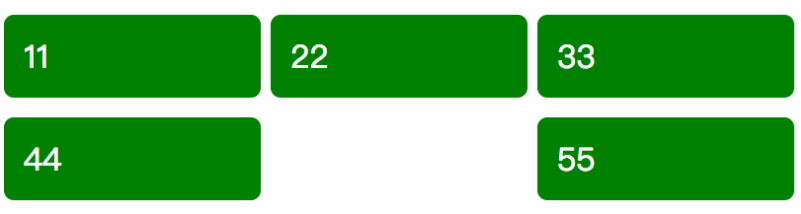
你的排版是这样的
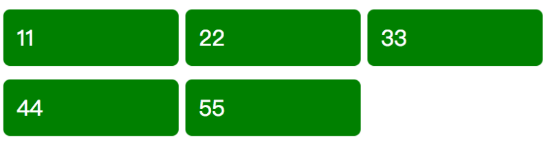
解决方法:追加一个空的子元素,子元素宽度保持一致
.box:after {content: ""; width: 100px; }
space-around设置同理
解决display:flex属性 justify-content: space-between和space-around换行后的排版问题
原文:https://www.cnblogs.com/tristers/p/14276510.html