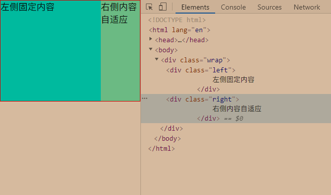
左侧固定,右侧自适应,不给右侧设置固定宽度即可
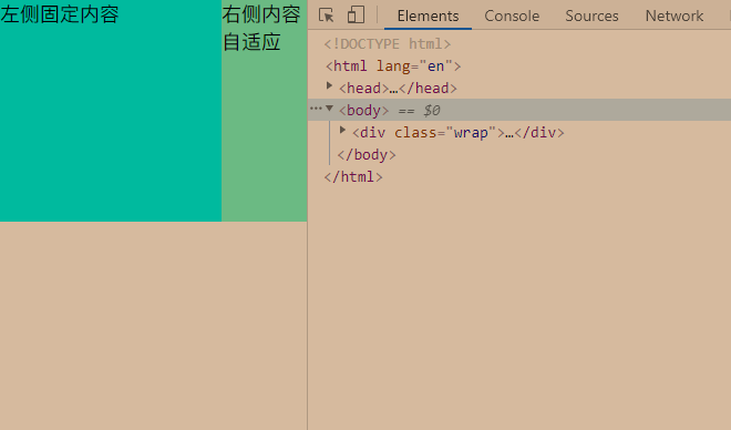
1     <div class="wrap">
2         <div class="left">
3             左侧固定内容
4         </div>
5         <div class="right">
6             右侧内容自适应
7         </div>
8     </div>
 1     * {
 2         margin: 0;
 3         padding: 0;
 4     }
 5
 6     .wrap {
 7         overflow: hidden;
 8         border: 1px solid red;
 9     }
10
11     .left {
12         float: left;
13         width: 200px;
14         height: 200px;
15         background: aqua;
16     }
17
18     .right {
19         margin-left: 200px;
20         background: aquamarine;
21         height: 200px;
22     }

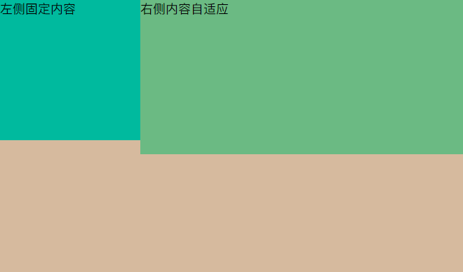
1     <div class="wrap">
2         <div class="left">
3             左侧固定内容
4         </div>
5         <div class="right">
6             右侧内容自适应
7         </div>
8     </div>
 1     * {
 2         margin: 0;
 3         padding: 0;
 4     }
 5
 6     .wrap {
 7         overflow: hidden;
 8         position: relative;
 9     }
10
11     .left {
12         position: absolute;
13         left: 0;
14         top: 0;
15         width: 200px;
16         height: 200px;
17         background: aqua;
18     }
19
20     .right {
21         margin-left: 200px;
22         background: aquamarine;
23         height: 220px;
24     }
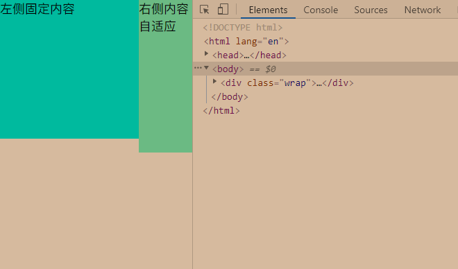
1     <div class="wrap">
2         <div class="left">
3             左侧固定内容
4         </div>
5         <div class="right">
6             右侧内容自适应
7         </div>
8     </div>
 1     * {
 2         margin: 0;
 3         padding: 0;
 4     }
 5
 6     .wrap {
 7         display: flex;
 8     }
 9
10     .left {
11         width: 200px;
12         height: 200px;
13         background: aqua;
14     }
15
16     .right {
17         background: aquamarine;
18         height: 200px;
19         flex: 1;
20     }


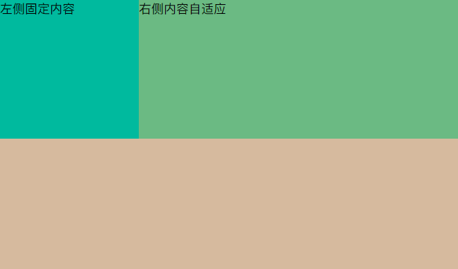
1     <div class="wrap">
2         <div class="left">
3             左侧固定内容
4         </div>
5         <div class="right">
6             右侧内容自适应
7         </div>
8     </div>
 1     * {
 2         margin: 0;
 3         padding: 0;
 4     }
 5
 6     .wrap {
 7         display: table;
 8         width: 100%;
 9     }
10
11     .left {
12         display: table-cell;
13         width: 200px;
14         height: 200px;
15         background: aqua;
16     }
17
18     .right {
19         display: table-cell;
20         background: aquamarine;
21         height: 200px;
22     }
原文:https://www.cnblogs.com/memeflyfly/p/14305107.html