


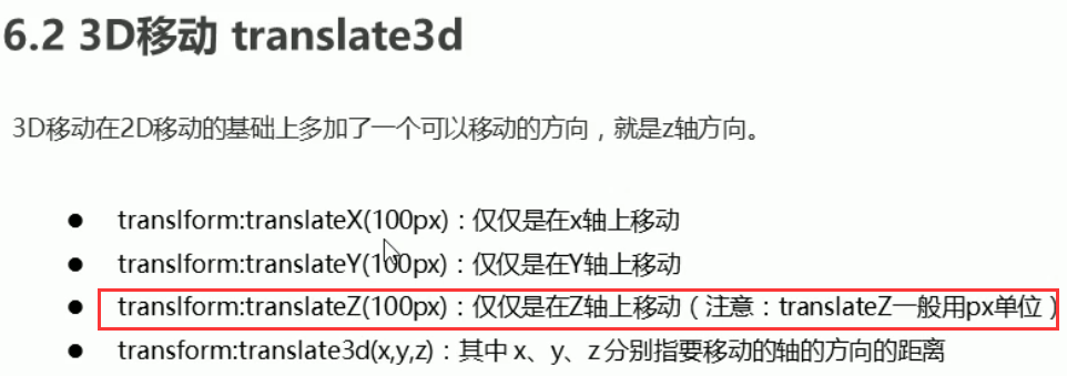
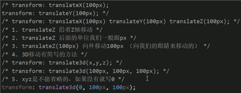
z轴单位一般不用 百分比 直接用精确的单位
一 透视
per spect ive

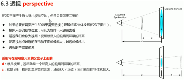
perspective: 500px; [值是 视距 就是上图中的 d距离 ]
body {
    perspective: 500px;//透视的值是: 视距px
}

div {
    width: 200px;
    height: 200px;
    margin: 100px auto;
    background-color: pink;
    transform: translateZ(0);//设置z轴
}
<div></div>
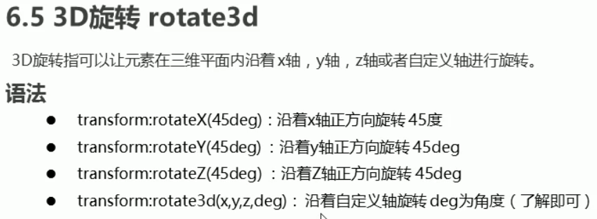
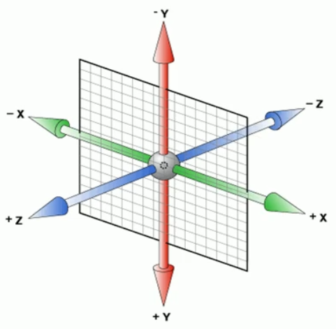
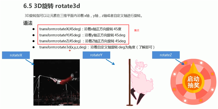
2d里面只能按角度旋转
3d里面可以按 X Y Z 或自定义轴旋转
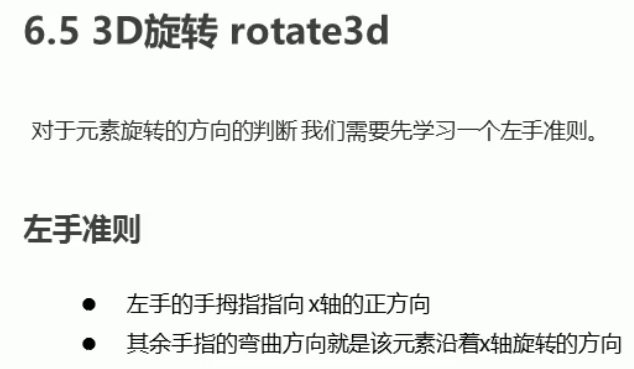
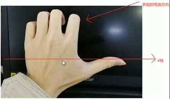
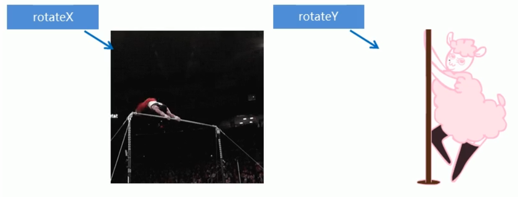
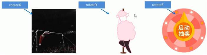
 x轴旋转就像单杠一样 正值 左手法则
y轴旋转就像钢管舞一样
.
<!doctype html>
<html lang="en">
<head>
    <meta charset="UTF-8">
    <title>rotateY旋转</title>
    <style>
        body {
            perspective: 500px;
        }
        img {
            display: block;
            margin: 100px auto;
            transition: all 1s;
        }
        img:hover {
            transform: rotateY(180deg);
        }
    </style>
</head>
<body>
<div><img src="img/ym.jpg" alt=""></div>

</body>
</html>

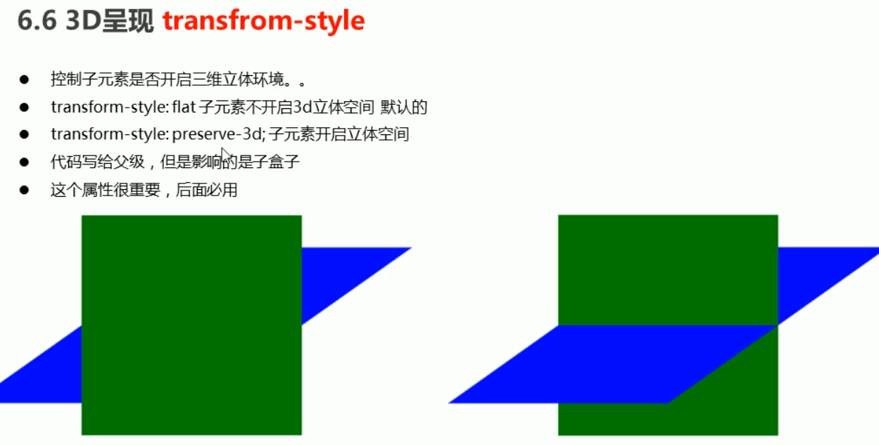
<!doctype html>
<html lang="en">
<head>
    <meta charset="UTF-8">
    <title>rotate</title>
    <style>
        body {
            perspective: 500px;
        }
        .father {
            position: relative;
            width: 300px;
            margin: 100px auto;
            /*开启子元素的三维立体空间*/
            transform-style: preserve-3d;
        }
        .father:hover {
            transform: rotateY(70deg);
            transition: all 2s;
        }
        .a {
            position: absolute;
            width: 300px;
            height: 300px;
            background: pink;
        }
        .b {
            position: absolute;
            width: 300px;
            height: 300px;
            background: blue;
            transform: rotateX(70deg);
        }
    </style>
</head>
<body>
<div class="father">
    <div class="a">a</div>
    <div class="b">b</div>
</div>

</body>
</html>
原文:https://www.cnblogs.com/fuyunlin/p/14364105.html