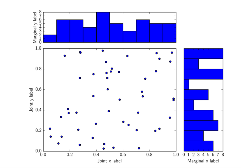
import matplotlib.pyplot as plt

from matplotlib.gridspec import GridSpec
import numpy as np

x = np.random.rand(50)
y = np.random.rand(50)

fig = plt.figure()

gs = GridSpec(4,4)

ax_joint = fig.add_subplot(gs[1:4,0:3])
ax_marg_x = fig.add_subplot(gs[0,0:3])
ax_marg_y = fig.add_subplot(gs[1:4,3])

ax_joint.scatter(x,y)
ax_marg_x.hist(x)
ax_marg_y.hist(y,orientation="horizontal")

# Turn off tick labels on marginals
plt.setp(ax_marg_x.get_xticklabels(), visible=False)
plt.setp(ax_marg_y.get_yticklabels(), visible=False)

# Set labels on joint
ax_joint.set_xlabel(‘Joint x label‘)
ax_joint.set_ylabel(‘Joint y label‘)

# Set labels on marginals
ax_marg_y.set_xlabel(‘Marginal x label‘)
ax_marg_x.set_ylabel(‘Marginal y label‘)
plt.show(
)
原文:https://www.cnblogs.com/mercurysun/p/14391750.html