参考:5种方法教你用Python玩转histogram直方图
参考:Python利用matplotlib.pyplot绘图时如何设置坐标轴刻度
设置百分比
def to_percent(y,position):
    return str(round(100*y,2))+"%"

plt.hist(xx, bins, facecolor=‘blue‘, edgecolor=‘black‘, alpha=0.7, weights=[1./len(xx)]*len(xx))

fomatter=FuncFormatter(to_percent)
plt.gca().yaxis.set_major_formatter(fomatter)
设置横坐标显示区间
xx = np.array(ratios_10m)
bins = range(0, 101, 10)
刻度显示
plt.xlim(0, 100)
plt.xticks(range(0, 101, 10))
代码示例参考:
from matplotlib.ticker import FuncFormatter
import folium
def to_percent(y,position):
return str(round(100*y,2))+"%"
#for i in range(3):
for i in range(len(ratios_new)):
print(‘*‘*100)
print(‘*‘*100)
print()
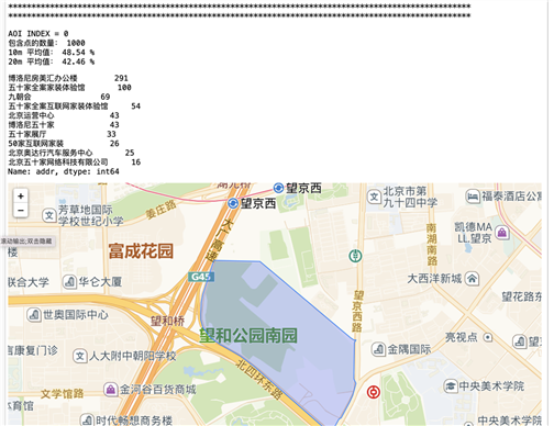
print("AOI INDEX =", i)
print("包含点的数量:", len(ratios_new[i][0]))
print("10m 平均值:", round(sum(ratios_new[i][0])/len(ratios_new[i][0]), 2), "%")
print("20m 平均值:", round(sum(ratios_new[i][1])/len(ratios_new[i][1]), 2), "%")
df[df[‘aoi_id‘] == aoi_wj_new[i][0]][‘addr‘].value_counts().head(10)
# 加载高德地图瓦片
pts = [[pt[1], pt[0]] for pt in aoi_wj_new[i][1].exterior.coords[:]]
lats = [pt[0] for pt in pts]
lngs = [pt[1] for pt in pts]
m=folium.Map(location=[sum(lats)/len(lats), sum(lngs)/len(lngs)],
zoom_start=15,
tiles=‘http://webst04.is.autonavi.com/appmaptile?style=7&x={x}&y={y}&z={z}‘,
attr=‘default‘)
_ = folium.Polygon([[pt[1], pt[0]] for pt in aoi_wj_new[i][1].exterior.coords[:]], weight=1.5, fill_color=‘blue‘).add_to(m)
m
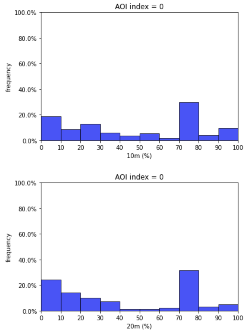
ratios_10m = ratios_new[i][0]
ratios_20m = ratios_new[i][1]
# 10m
xx = np.array(ratios_10m)
# 确定很坐标显示的范围
bins = range(0, 101, 10)
_ = plt.hist(xx, bins, facecolor=‘blue‘, edgecolor=‘black‘, alpha=0.7, weights=[1./len(xx)]*len(xx))
_ = plt.xlabel("10m (%)")
_ = plt.ylabel("frequency")
fomatter=FuncFormatter(to_percent)
_ = plt.gca().yaxis.set_major_formatter(fomatter)
_ = plt.xlim(0, 100)
_ = plt.xticks(range(0, 101, 10))
_ = plt.ylim(0, 1)
_ = plt.title("AOI index = " + str(i))
_ = plt.show()
# 20m
xx = np.array(ratios_20m)
# 确定很坐标显示的范围
bins = range(0, 101, 10)
_ = plt.hist(xx, bins, facecolor=‘blue‘, edgecolor=‘black‘, alpha=0.7, weights=[1./len(xx)]*len(xx))
_ = plt.xlabel("20m (%)")
_ = plt.ylabel("frequency")
fomatter=FuncFormatter(to_percent)
_ = plt.gca().yaxis.set_major_formatter(fomatter)
_ = plt.xlim(0, 100)
_ = plt.xticks(range(0, 101, 10))
_ = plt.ylim(0, 1)
_ = plt.title("AOI index = " + str(i))
_ = plt.show()
显示效果
原文:https://www.cnblogs.com/alex-bn-lee/p/14617883.html