HTML在面试中占比不大,面试的重点一般不会放在HTML上。
如何理解HTML语义化?
语义化是为了能够读懂代码:
让人更容易读懂,增加代码的可读性。所有元素都使用<div>标签,与在段落使用<p>标签,列表使用<ul>,<li>,明显后者能更容易地去理解代码要表达的意思。
让搜索引擎更容易读懂(SEO)。
默认情况下,哪些HTML标签是块级元素,哪些是内联元素?
display: block/table; 有div, h1, h2, table, ul, ol, p等。块级元素独占一行。display:inline/inline-block; 有span, img, input, button等。内联元素不会独占一行,会一直往后排列,直到浏览器的边缘或者换行为止。先梳理一下CSS的知识模块有哪些:
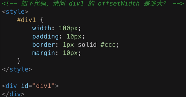
? offsetWidth = (内容宽度+内边距+边框),无外边距 ==> 上图答案:122px
? 补充:如果让offsetWidth等于100px,该怎么做?
? 答案:添加box-sizing: border-box;
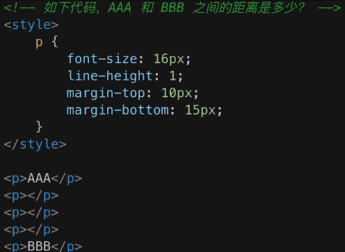
? 相邻元素的margin-top和margin-bottom会发生重叠。
? 空白内容的<p></p>也会重叠。
? 上图答案:15px
margin负值的问题
对margin的top, right, bottom, left设置负值,有何效果?
margin-top和margin-left设置负值,元素会向上、向左移动;
margin-right设置负值,右侧元素左移,自身不受影响;
margin-bottom设置负值,下方元素上移,自身不受影响。
BFC的理解和应用
什么是BFC?如何应用?
BFC:Block Format Context,块级格式化上下文。是一块独立的渲染区域,内部元素的渲染不会影响边界以外的元素。
overflow: hidden;)float布局的问题,以及clearfix
如何实现圣杯布局和双飞翼布局?(考察float布局的重要方式)
圣杯布局和双飞翼布局的目的:
圣杯布局和双飞翼布局的技术总结:
<!-- 圣杯布局 -->
<!DOCTYPE html>
<html lang="en">
  <head>
    <meta charset="UTF-8" />
    <meta http-equiv="X-UA-Compatible" content="IE=edge" />
    <meta name="viewport" content="width=device-width, initial-scale=1.0" />
    <title>圣杯布局</title>
    <style>
      header {
        width: 100%;
        height: 50px;
        line-height: 50px;
        text-align: center;
        background-color: rgb(165, 154, 154);
      }
      footer {
        clear: both;
        width: 100%;
        height: 50px;
        line-height: 50px;
        text-align: center;
        background-color: rgb(165, 154, 154);
      }
      .content {
        padding: 0 150px 0 200px;
        position: relative;
      }
      .main {
        background-color: rgb(190, 137, 137);
        width: 100%;
        float: left;
      }
      .left {
        position: relative;
        background-color: rgb(125, 179, 156);
        width: 200px;
        float: left;
        margin-left: -100%;
        right: 200px;
      }
      .right {
        background-color: rgb(122, 150, 201);
        width: 150px;
        float: left;
        margin-right: -150px;
      }
    </style>
  </head>
  <body>
    <header>header</header>
    <div class="content">
      <div class="main">main</div>
      <div class="left">left</div>
      <div class="right">right</div>
    </div>
    <footer>footer</footer>
  </body>
</html>
<!-- 双飞翼布局 -->
<!DOCTYPE html>
<html lang="en">
  <head>
    <meta charset="UTF-8" />
    <meta http-equiv="X-UA-Compatible" content="IE=edge" />
    <meta name="viewport" content="width=device-width, initial-scale=1.0" />
    <title>双飞翼布局</title>
    <style>
      header {
        height: 50px;
        line-height: 50px;
        background-color: rgb(177, 169, 169);
        text-align: center;
      }
      footer {
        height: 50px;
        line-height: 50px;
        background-color: rgb(177, 169, 169);
        text-align: center;
        clear: both;
      }
      .content {
        width: 100%;
      }
      .main {
        width: 100%;
        background-color: rgb(235, 102, 102);
        float: left;
      }
      .main-wrap {
        margin: 0 150px 0 200px;
      }
      .left {
        width: 200px;
        background-color: rgb(228, 207, 88);
        float: left;
        margin-left: -100%;
      }
      .right {
        width: 150px;
        background-color: rgb(124, 238, 175);
        float: left;
        margin-left: -150px;
      }
    </style>
  </head>
  <body>
    <header>header</header>
    <div class="content">
      <div class="main">
        <div class="main-wrap">main</div>
      </div>
      <div class="left">left</div>
      <div class="right">right</div>
    </div>
    <footer>footer</footer>
  </body>
</html>
圣杯布局和双飞翼布局的对比:
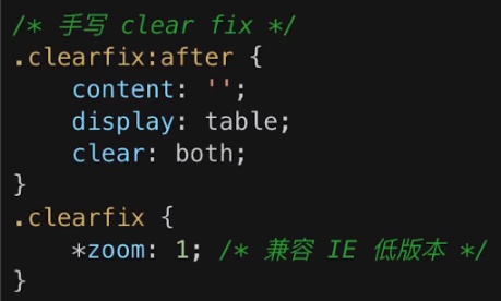
position: reletive;和right: 200px;,双飞翼布局没有用到相对定位,复杂度更加低一些;margin-right,双飞翼布局中使用的是margin-left。二者相比,margin-left要更容易理解一些;手写clearfix
      /* 手写clear-fix */
      .clear-fix:after {
        content: "";
        display: table;
        clear: both;
      }
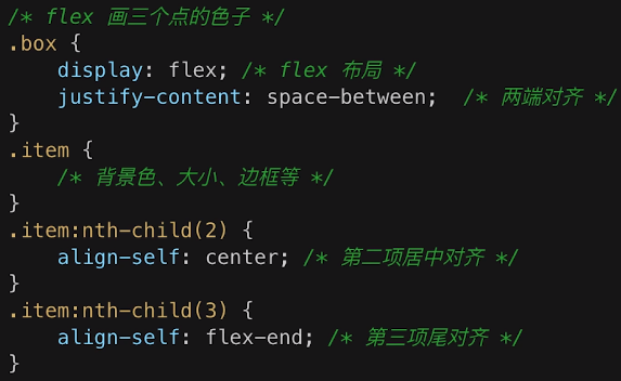
flex画骰子
实现一个三点的骰子:一个骰子的一个面,左上角、中心、右下角各有一个点
flex常用语法回顾:
容器常用属性:flex-direction, justify-content, align-items, flex-wrap
项目常用属性:align-self
<!DOCTYPE html>
<html lang="en">
  <head>
    <meta charset="UTF-8" />
    <meta http-equiv="X-UA-Compatible" content="IE=edge" />
    <meta name="viewport" content="width=device-width, initial-scale=1.0" />
    <title>flex画三色的骰子</title>
  </head>
  <style>
    .box {
      width: 200px;
      height: 200px;

      border: 1px solid #000;
      display: flex;
      justify-content: space-between;
    }
    .item {
      width: 50px;
      height: 50px;
      border-radius: 50%;
      border: 1px solid #000;
    }
    .item:nth-child(2) {
      align-self: center;
    }
    .item:nth-child(3) {
      align-self: flex-end;
    }
  </style>
  <body>
    <div class="box">
      <div class="item"></div>
      <div class="item"></div>
      <div class="item"></div>
    </div>
  </body>
</html>
absolute和relative分别依据什么定位?
relative依据自身定位;relative依据最近一层的定位元素定位(父元素一层一层往上找),定位元素包括:position属性为absolute, relative, fixed的元素以及<body>标签
居中对齐有哪些实现方式?
居中对齐分为水平居中和垂直居中。
text-align: center;margin: auto;left: 50% + margin-left负值line-height: height的值top: 50% + margin-top负值top: 50% + transform: translate (-50%, -50%) (旧的浏览器兼容性可能存在问题,但是不需要知道子元素的宽高就可以实现)top, left, bottom, right = 0 + margin: auto;(浏览器兼容性不存在问题,而且不需要知道子元素的尺寸)line-height的继承问题
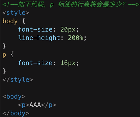
答案:40px。
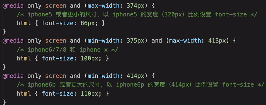
rem是什么?
rem是一个长度单位。
<html>),常用于响应式布局。任何可以使用长度的地方都可以使用rem。如何实现响应式?
vw/vh
网页视口尺寸
window.screen.height:屏幕高度window.innerHeight:网页视口高度document.body.clientHeight:body高度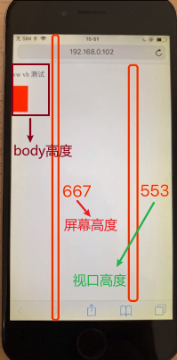
vh:网页视口高度的1%(1/100)
vw:网页视口宽度的1%(1/100)
vmax:取vh和vw两者最大值;
vmin:取vh和vw两者最小值;
原文:https://www.cnblogs.com/cat-meow/p/14668787.html