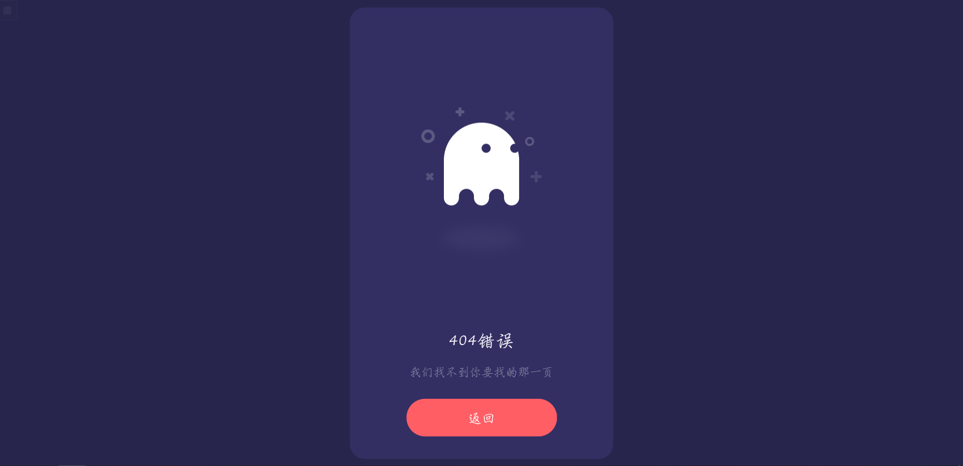
效果图:
页面代码
html
<!DOCTYPE html>
<html>
<head>
    <meta charset="utf-8">
    <meta name="viewport" content="width=device-width, initial-scale=1.0, minimum-scale=1.0, maximum-scale=1.0,user-scalable=no">
    <title>404页面-卡片式可爱幽灵</title>
    <link rel="stylesheet" href="./404.css">
    <!-- 在线链接,可更换本地链接 -->
    <script src="https://code.jquery.com/jquery-3.5.1.min.js"></script>
</head>
<body>
    <div class="box">
        <div class="box__ghost">
            <div class="symbol"></div>
            <div class="symbol"></div>
            <div class="symbol"></div>
            <div class="symbol"></div>
            <div class="symbol"></div>
            <div class="symbol"></div>
            <div class="box__ghost-container">
                <div class="box__ghost-eyes">
                    <div class="box__eye-left"></div>
                    <div class="box__eye-right"></div>
                </div>
                <div class="box__ghost-bottom">
                    <div></div>
                    <div></div>
                    <div></div>
                    <div></div>
                    <div></div>
                </div>
            </div>
            <div class="box__ghost-shadow"></div>
        </div>
        <div class="box__description">
            <div class="box__description-container">
                <div class="box__description-title">404错误</div>
                <div class="box__description-text">我们找不到你要找的那一页</div>
            </div>
            <a href="javascript:;" class="box__button">返回</a>
        </div>
    </div>
    <script>
        var pageX = $(document).width();
        var pageY = $(document).height();
        var mouseY = 0;
        var mouseX = 0;
        $(document).mousemove(function(event) {
            //verticalAxis
            mouseY = event.pageY;
            yAxis = (pageY / 2 - mouseY) / pageY * 300;
            //horizontalAxis
            mouseX = event.pageX / -pageX;
            xAxis = -mouseX * 100 - 100;
            $(‘.box__ghost-eyes‘).css({
                ‘transform‘: ‘translate(‘ + xAxis + ‘%,-‘ + yAxis + ‘%)‘
            });
            //console.log(‘X: ‘ + xAxis);
        });
    </script>
</body>
</html>
CSS
html,
body {
    background: #28254C;
    font-family: ‘Ubuntu‘;
}

* {
    box-sizing: border-box;
}

.box {
    width: 350px;
    height: 100%;
    max-height: 600px;
    min-height: 450px;
    background: #332F63;
    border-radius: 20px;
    position: absolute;
    left: 50%;
    top: 50%;
    transform: translate(-50%, -50%);
    padding: 30px 50px;
}

.box .box__ghost {
    padding: 15px 25px 25px;
    position: absolute;
    left: 50%;
    top: 30%;
    transform: translate(-50%, -30%);
}

.box .box__ghost .symbol:nth-child(1) {
    opacity: .2;
    animation: shine 4s ease-in-out 3s infinite;
}

.box .box__ghost .symbol:nth-child(1):before,
.box .box__ghost .symbol:nth-child(1):after {
    content: ‘‘;
    width: 12px;
    height: 4px;
    background: #fff;
    position: absolute;
    border-radius: 5px;
    bottom: 65px;
    left: 0;
}

.box .box__ghost .symbol:nth-child(1):before {
    transform: rotate(45deg);
}

.box .box__ghost .symbol:nth-child(1):after {
    transform: rotate(-45deg);
}

.box .box__ghost .symbol:nth-child(2) {
    position: absolute;
    left: -5px;
    top: 30px;
    height: 18px;
    width: 18px;
    border: 4px solid;
    border-radius: 50%;
    border-color: #fff;
    opacity: .2;
    animation: shine 4s ease-in-out 1.3s infinite;
}

.box .box__ghost .symbol:nth-child(3) {
    opacity: .2;
    animation: shine 3s ease-in-out .5s infinite;
}

.box .box__ghost .symbol:nth-child(3):before,
.box .box__ghost .symbol:nth-child(3):after {
    content: ‘‘;
    width: 12px;
    height: 4px;
    background: #fff;
    position: absolute;
    border-radius: 5px;
    top: 5px;
    left: 40px;
}

.box .box__ghost .symbol:nth-child(3):before {
    transform: rotate(90deg);
}

.box .box__ghost .symbol:nth-child(3):after {
    transform: rotate(180deg);
}

.box .box__ghost .symbol:nth-child(4) {
    opacity: .2;
    animation: shine 6s ease-in-out 1.6s infinite;
}

.box .box__ghost .symbol:nth-child(4):before,
.box .box__ghost .symbol:nth-child(4):after {
    content: ‘‘;
    width: 15px;
    height: 4px;
    background: #fff;
    position: absolute;
    border-radius: 5px;
    top: 10px;
    right: 30px;
}

.box .box__ghost .symbol:nth-child(4):before {
    transform: rotate(45deg);
}

.box .box__ghost .symbol:nth-child(4):after {
    transform: rotate(-45deg);
}

.box .box__ghost .symbol:nth-child(5) {
    position: absolute;
    right: 5px;
    top: 40px;
    height: 12px;
    width: 12px;
    border: 3px solid;
    border-radius: 50%;
    border-color: #fff;
    opacity: .2;
    animation: shine 1.7s ease-in-out 7s infinite;
}

.box .box__ghost .symbol:nth-child(6) {
    opacity: .2;
    animation: shine 2s ease-in-out 6s infinite;
}

.box .box__ghost .symbol:nth-child(6):before,
.box .box__ghost .symbol:nth-child(6):after {
    content: ‘‘;
    width: 15px;
    height: 4px;
    background: #fff;
    position: absolute;
    border-radius: 5px;
    bottom: 65px;
    right: -5px;
}

.box .box__ghost .symbol:nth-child(6):before {
    transform: rotate(90deg);
}

.box .box__ghost .symbol:nth-child(6):after {
    transform: rotate(180deg);
}

.box .box__ghost .box__ghost-container {
    background: #fff;
    width: 100px;
    height: 100px;
    border-radius: 100px 100px 0 0;
    position: relative;
    margin: 0 auto;
    animation: upndown 3s ease-in-out infinite;
}

.box .box__ghost .box__ghost-container .box__ghost-eyes {
    position: absolute;
    left: 50%;
    top: 45%;
    height: 12px;
    width: 70px;
}

.box .box__ghost .box__ghost-container .box__ghost-eyes .box__eye-left {
    width: 12px;
    height: 12px;
    background: #332F63;
    border-radius: 50%;
    margin: 0 10px;
    position: absolute;
    left: 0;
}

.box .box__ghost .box__ghost-container .box__ghost-eyes .box__eye-right {
    width: 12px;
    height: 12px;
    background: #332F63;
    border-radius: 50%;
    margin: 0 10px;
    position: absolute;
    right: 0;
}

.box .box__ghost .box__ghost-container .box__ghost-bottom {
    display: flex;
    position: absolute;
    top: 100%;
    left: 0;
    right: 0;
}

.box .box__ghost .box__ghost-container .box__ghost-bottom div {
    flex-grow: 1;
    position: relative;
    top: -10px;
    height: 20px;
    border-radius: 100%;
    background-color: #fff;
}

.box .box__ghost .box__ghost-container .box__ghost-bottom div:nth-child(2n) {
    top: -12px;
    margin: 0 -0px;
    border-top: 15px solid #332F63;
    background: transparent;
}

.box .box__ghost .box__ghost-shadow {
    height: 20px;
    box-shadow: 0 50px 15px 5px #3B3769;
    border-radius: 50%;
    margin: 0 auto;
    animation: smallnbig 3s ease-in-out infinite;
}

.box .box__description {
    position: absolute;
    bottom: 30px;
    left: 50%;
    transform: translateX(-50%);
}

.box .box__description .box__description-container {
    color: #fff;
    text-align: center;
    width: 200px;
    font-size: 16px;
    margin: 0 auto;
}

.box .box__description .box__description-container .box__description-title {
    font-size: 24px;
    letter-spacing: .5px;
}

.box .box__description .box__description-container .box__description-text {
    color: #8C8AA7;
    line-height: 20px;
    margin-top: 20px;
}

.box .box__description .box__button {
    display: block;
    position: relative;
    background: #FF5E65;
    border: 1px solid transparent;
    border-radius: 50px;
    height: 50px;
    text-align: center;
    text-decoration: none;
    color: #fff;
    line-height: 50px;
    font-size: 18px;
    padding: 0 70px;
    white-space: nowrap;
    margin-top: 25px;
    transition: background .5s ease;
    overflow: hidden;
}

.box .box__description .box__button:before {
    content: ‘‘;
    position: absolute;
    width: 20px;
    height: 100px;
    background: #fff;
    bottom: -25px;
    left: 0;
    border: 2px solid #fff;
    transform: translateX(-50px) rotate(45deg);
    transition: transform .5s ease;
}

.box .box__description .box__button:hover {
    background: transparent;
    border-color: #fff;
}

.box .box__description .box__button:hover:before {
    transform: translateX(250px) rotate(45deg);
}

@keyframes upndown {
    0% {
        transform: translateY(5px);
    }
    50% {
        transform: translateY(15px);
    }
    100% {
        transform: translateY(5px);
    }
}

@keyframes smallnbig {
    0% {
        width: 90px;
    }
    50% {
        width: 100px;
    }
    100% {
        width: 90px;
    }
}

@keyframes shine {
    0% {
        opacity: .2;
    }
    25% {
        opacity: .1;
    }
    50% {
        opacity: .2;
    }
    100% {
        opacity: .2;
    }
}
原文:https://www.cnblogs.com/svyt/p/14802740.html