| 基础信息 | |
|---|---|
| 默认值: | none 0 ease 0 1 normal |
| 继承性: | no |
| 版本: | CSS3 |
| JavaScript 语法: | object.style.animation="mymove 5s infinite" |
语法:animation: name duration timing-function delay iteration-count direction;
| 值 | 描述 |
|---|---|
| animation-name | 规定需要绑定到选择器的 keyframe 名称。 |
| animation-duration: time | 规定完成动画所花费的时间,以秒或毫秒计。 |
| animation-timing-function: value | 规定动画的速度曲线。 |
| animation-delay: time | 规定在动画开始之前的延迟。举例:animation-delay: 2s\200ms |
| animation-iteration-count: n\infinite | 规定动画应该播放的次数。 |
| animation-direction: normal\alternate | 规定是否应该轮流反向播放动画。 |
value 的可能值:
| 值 | 描述 |
|---|---|
| linear | 动画从头到尾的速度是相同的。 |
| ease | 默认。动画以低速开始,然后加快,在结束前变慢。 |
| ease-in | 动画以低速开始。 |
| ease-out | 动画以低速结束。 |
| ease-in-out | 动画以低速开始和结束。 |
| cubic-bezier(n,n,n,n) | 在 cubic-bezier 函数中自己的值。可能的值是从 0 到 1 的数值。 |
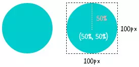
.circle{
    width:100px;
    height:100px;
    background:#0cc;
    -webkit-clip-path:circle(50% at 50% 50%);
  }
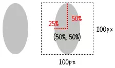
 .ellipse{
    width:100px;
    height:100px;
    background:#aaa;
    -webkit-clip-path:ellipse(25% 50% at 50% 50%);
  }
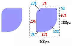
  .inset{
    width:100px;
    height:100px;
    background:#99f;
    -webkit-clip-path:inset(10px 20px 30px 10px round 20px 5px 50px 0);
  }
多边形polygon(有几个角就设几个值,每个值都记录了折角的(x y)坐标)
-webkit-clip-path:polygon(0% 100%, 50% 0%,100% 100%);
两点注意事项:
使用举例:赋值代码看效果
<!DOCTYPE html>
<html lang="en">

<head>
  <meta charset="UTF-8" />
  <meta http-equiv="X-UA-Compatible" content="IE=edge" />
  <meta name="viewport" content="width=device-width, initial-scale=1.0" />
  <title>Document</title>
  <style>
    .box {
      width: 200px;
      height: 200px;
      animation: clipPath 4s linear 0s infinite alternate;
    }

    @keyframes clipPath {

      /* 正三角形 */
      0% {
        width: 100px;
        height: 87px;
        background-color: red;
        clip-path: polygon(50% 0%, 0% 100%, 100% 100%, 100% 100%, 100% 100%, 100% 100%);
      }

      /* 正方形 */
      33% {
        width: 100px;
        height: 100px;
        background-color: orange;
        clip-path: polygon(0% 0%, 0% 100%, 100% 100%, 100% 0, 100% 0%, 100% 0%);
      }

      /* 五边形 */
      66% {
        width: 162px;
        height: 154px;
        background-color: yellow;
        clip-path: polygon(0% 38.31%, 19.14% 100%, 80.86% 100%, 100% 38.31%, 50% 0%, 50% 0%);
      }

      /* 六边形 */
      100% {
        width: 200px;
        height: 174px;
        background-color: yellowgreen;
        clip-path: polygon(0% 50%, 25% 100%, 75% 100%, 100% 50%, 75% 0%, 25% 0%);
      }
    }
  </style>
</head>

<body>
  <div id="app">
    <div class="box">
    </div>
  </div>
</body>

</html>
原文:https://www.cnblogs.com/MrZhujl/p/14860072.html