测试链接:
https://echarts.apache.org/examples/zh/editor.html?c=custom-profile
操作方法,将下述代码copy到编辑窗口,即可进行相应测试。
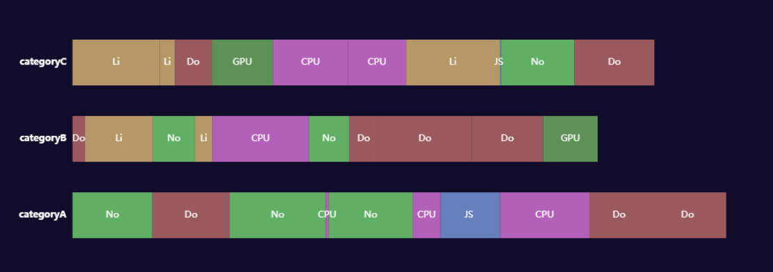
var data = [];
var dataCount = 10;
var startTime = +new Date();
var categories = [‘categoryA‘, ‘categoryB‘, ‘categoryC‘];
var types = [
    {name: ‘JS ‘, color: ‘#7b9ce1‘},
    {name: ‘Do‘, color: ‘#bd6d6c‘},
    {name: ‘No‘, color: ‘#75d874‘},
    {name: ‘Li‘, color: ‘#e0bc78‘},
    {name: ‘CPU‘, color: ‘#dc77dc‘},
    {name: ‘GPU‘, color: ‘#72b362‘}
];

// Generate mock data
categories.forEach(function (category, index) {
    var baseTime = startTime;
    for (var i = 0; i < dataCount; i++) {
        var typeItem = types[Math.round(Math.random() * (types.length - 1))];
        var duration = Math.round(Math.random() * 10000);
        data.push({
            name: typeItem.name,
            value: [
                index,
                baseTime,
                baseTime += duration,
                duration
            ],
            itemStyle: {
                normal: {
                    color: typeItem.color
                }
            }
        });

    }
});

//自定义图形
function renderItem(params, api) {
    var categoryIndex = api.value(0);
    var start = api.coord([api.value(1), categoryIndex]);
    var end = api.coord([api.value(2), categoryIndex]);
    var height = api.size([0, 1])[1] * 0.6;

    var rectShape = echarts.graphic.clipRectByRect({
        x: start[0],
        y: start[1] - height / 2,
        width: end[0] - start[0],
        height: height
    }, {
        x: params.coordSys.x,
        y: params.coordSys.y,
        width: params.coordSys.width,
        height: params.coordSys.height
    });

    return rectShape && {
        type: ‘rect‘,
        transition: [‘shape‘],
        shape: rectShape,
        style: api.style()
    };
}


option = {
    tooltip: {
        formatter: function (params) {
            return params.marker + params.name + ‘: ‘ + params.value[3] + ‘ ms‘;
        }
    },

    textStyle: {
            fontSize: 40,
            color: ‘#FFF‘,//文字颜色
            fontWeight: "bold"
                },
    title: {
        text: ‘Profile‘,
        left: ‘center‘,
        show:false
    },
    dataZoom: [{
        type: ‘slider‘,
        filterMode: ‘weakFilter‘,
        showDataShadow: false,
        top: 10,
        labelFormatter: ‘‘,
        show:false,
        enabled:false
    }, {
        type: ‘inside‘,
        filterMode: ‘weakFilter‘
    }],
    grid: {
        height: 300
    },
    xAxis: {
        min: startTime,
        scale: true,
        show:false,
        axisLabel: {
            formatter: function (val) {
                return Math.max(0, val - startTime) + ‘ ms‘;
            }
        },
        axisLine:{show:false},

    },
    yAxis: {
        splitLine:{show:false},
        axisTick:{show:false},//Y轴间距线
        axisLine:{show:false},//Y 轴线
        data: categories,
        //color:‘#FFF‘
    },
    series: [{
        type: ‘custom‘,
        renderItem: renderItem,
        itemStyle: {
            opacity: 0.8
        },
        encode: {
            x: [1, 2],
            y: 0
        },
        data:data,
         label: {
                show: true,
                formatter:function (params) {
                    return  params.name ;//返回type名
                },
                textStyle:{
                    fontSize:1,
                    shadowBlur:false,
                    color: ‘#FFF‘,//文字颜色
                }
            },
    }]
};
原文:https://www.cnblogs.com/chengcanghai/p/14863924.html