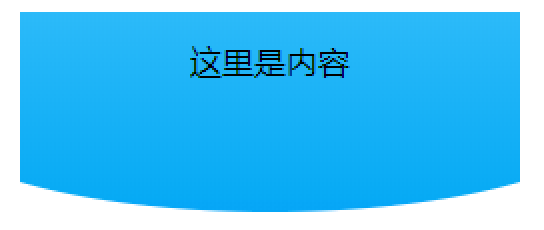
<div class="box">
<div class="home_top"> 这里是内容 </div>
</div>
.box { width: 250px; margin: auto; overflow: hidden; }
.home_top { position: relative; width: 100%; height: 100px; text-align: center; line-height: 50px; }
.home_top:after { width: 140%; height: 100px; position: absolute; left: -20%; top: 0; z-index: -1; content: ‘‘; border-radius: 0 0 50% 50%; background: linear-gradient(#2CBAF9, #04A9F4); }
效果图1:底部凸圆弧
.focus{ position: relative;}
.focus:after{ position:absolute; left:0; right:0; bottom:-11px; content:""; z-index:1; height:20px; width:100%; border-radius:50%; background:#fff;}
效果图2:底部凹圆弧

原文:https://www.cnblogs.com/Nyan-Workflow-FC/p/14930424.html