作者:李盼(Lipan)
出处:[Lipan] (http://www.cnblogs.com/lipan/)
版权声明:本文的版权归作者与博客园共有。转载时须注明本文的详细链接,否则作者将保留追究其法律责任。
本篇讲解Ext另一个重要的概念:布局。一般的容器类控件都是通过配置项items添加子控件的,这些子控件相对于父控件怎么定位呢,这里就要用到布局。某些容器类控件,它本身默认就集成了一种布局方式,例如比较典型的是:Ext.container.Viewport 布局控件,它其实就是一个border布局的容器,还有Ext.form.Panel、Ext.tab.Panel等。本节我们系统的分析各种布局方式。
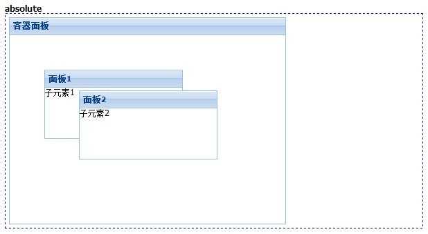
这种方式的布局可以对子元素相对于父级容器控件进行绝对定位,它包含了x、y两个配置项用于定位。
我们来看看一个例子:
[Js]
|
1
2
3
4
5
6
7
8
9
10
11
12
13
14
15
16
17
18
19
20
21
22
23
24
25
26
27
|
//absoluteExt.create(‘Ext.Panel‘, { title: ‘容器面板‘, renderTo: ‘div1‘, width: 400, height: 300, layout: ‘absolute‘, items: [{ title: ‘面板1‘, xtype: "panel", html: "子元素1", width: 200, height: 100, x: 50, y: 50 }, { title: ‘面板2‘, xtype: "panel", html: "子元素2", width: 200, height: 100, x: 100, y: 80 }]}); |
效果如下:
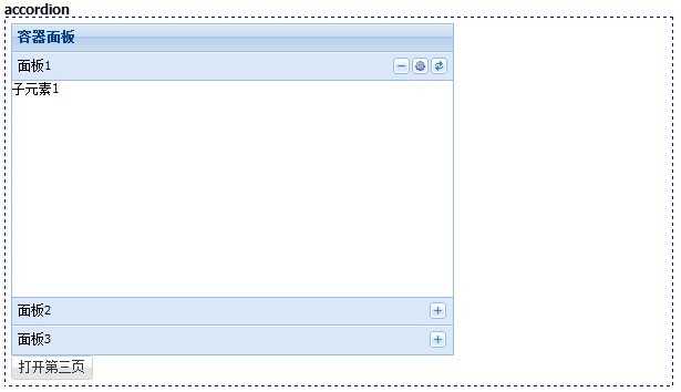
有的js插件里面accordion都是一个ui控件,但是Ext是通过布局的方式实现的,我们可以用面板控件作为它的折叠项,并且还可以用js来翻动活动项。
[Js]
|
1
2
3
4
5
6
7
8
9
10
11
12
13
14
15
16
17
18
19
20
21
22
23
24
25
26
27
28
29
30
31
32
33
34
|
//accordionExt.create(‘Ext.Panel‘, { title: ‘容器面板‘, renderTo: ‘div2‘, width: 400, height: 300, layout: ‘accordion‘, items: [{ tools: [{ type: ‘gear‘, handler: function () { Ext.Msg.alert(‘提示‘, ‘配置按钮被点击。‘); } }, { type: ‘refresh‘}], title: ‘面板1‘, xtype: "panel", html: "子元素1" }, { title: ‘面板2‘, xtype: "panel", html: "子元素2" }, { id: ‘panel3‘, title: ‘面板3‘, xtype: "panel", html: "子元素3" }]});Ext.create("Ext.Button", { renderTo: ‘div2‘, text: "打开第三页", handler: function () { Ext.getCmp(‘panel3‘).expand(true); }}); |
效果如下:
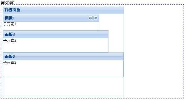
这个布局就是表单面板默认支持的,每一项占据一行,支持用anchor配置项分配各个子项的高度和宽度。为百分比时表示当前大小占父容器的百分比,为数字的时一般为负数,表示父容器的值减去差值,剩下的为子项的大小。
[Js]
|
1
2
3
4
5
6
7
8
9
10
11
12
13
14
15
16
17
18
19
20
21
22
23
24
25
26
27
28
29
|
//anchorExt.create(‘Ext.Panel‘, { title: ‘容器面板‘, renderTo: ‘div3‘, width: 400, height: 300, layout: ‘anchor‘, items: [{ tools: [{ type: ‘gear‘, handler: function () { Ext.Msg.alert(‘提示‘, ‘配置按钮被点击。‘); } }, { type: ‘refresh‘}], title: ‘面板1‘, xtype: "panel", html: "子元素1", anchor: ‘80% 20%‘ }, { title: ‘面板2‘, xtype: "panel", html: "子元素2", anchor: ‘-50 -200‘ }, { title: ‘面板3‘, xtype: "panel", html: "子元素3", anchor: ‘100% 30%‘ }]}); |
效果如下:
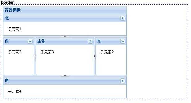
这个布局可以定义东南西北四个方向的子元素,还有一个居中的子元素,一般用它来做页面整页布局,所以Ext.container.Viewport默认就支持了这个布局方式。
[Js]
|
1
2
3
4
5
6
7
8
9
10
11
12
13
14
15
16
17
18
19
20
21
22
23
24
25
26
27
28
29
30
31
32
33
34
35
36
37
38
39
40
41
42
43
44
45
|
//borderExt.create(‘Ext.Panel‘, { title: ‘容器面板‘, renderTo: ‘div4‘, width: 400, height: 300, layout: ‘border‘, defaults: { split: true, //是否有分割线 collapsible: true, //是否可以折叠 bodyStyle: ‘padding:15px‘ }, items: [{ region: ‘north‘, //子元素的方位:north、west、east、center、south title: ‘北‘, xtype: "panel", html: "子元素1", height: 70 }, { region: ‘west‘, title: ‘西‘, xtype: "panel", html: "子元素2", width: 100 }, { region: ‘east‘, title: ‘东‘, xtype: "panel", html: "子元素2", width: 100 }, { region: ‘center‘, title: ‘主体‘, xtype: "panel", html: "子元素3" }, { region: ‘south‘, title: ‘南‘, xtype: "panel", html: "子元素4", height: 70 }]}); |
效果如下:
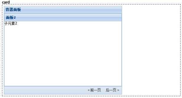
这个布局可以像卡片一样的切换每个子元素,各个子元素都会独占父元素的容器空间。我们可以定义翻页按钮来控制当前处于活动状态的子元素。
[Js]
|
1
2
3
4
5
6
7
8
9
10
11
12
13
14
15
16
17
18
19
20
21
22
23
24
25
26
27
28
29
30
31
32
33
34
35
36
37
38
39
40
41
42
43
44
45
|
//cardvar cardNav = function (incr) { var l = Ext.getCmp(‘cardPanel‘).getLayout(); var i = l.activeItem.id.split(‘card‘)[1]; var next = parseInt(i, 10) + incr; l.setActiveItem(next); Ext.getCmp(‘cardPrev‘).setDisabled(next === 0); Ext.getCmp(‘cardNext‘).setDisabled(next === 2);};Ext.create(‘Ext.Panel‘, { title: ‘容器面板‘, renderTo: ‘div5‘, width: 400, height: 300, layout: ‘card‘, activeItem: 1, //默认活动项 id: ‘cardPanel‘, items: [{ id: ‘card0‘, title: ‘面板1‘, xtype: "panel", html: "子元素1" }, { id: ‘card1‘, title: ‘面板2‘, xtype: "panel", html: "子元素2" }, { id: ‘card2‘, title: ‘面板3‘, xtype: "panel", html: "子元素3" }], bbar: [‘->‘, { id: ‘cardPrev‘, text: ‘« 前一页‘, handler: Ext.Function.bind(cardNav, this, [-1]) }, { id: ‘cardNext‘, text: ‘后一页 »‘, handler: Ext.Function.bind(cardNav, this, [1]) }]}); |
效果如下:
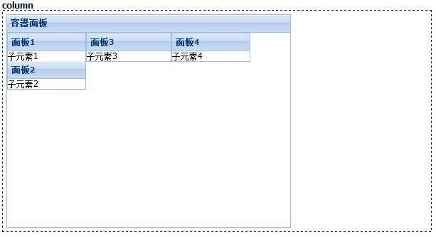
这个布局把子元素按照列进行划分。
[Js]
|
1
2
3
4
5
6
7
8
9
10
11
12
13
14
15
16
17
18
19
20
21
22
23
24
25
26
27
28
29
30
31
32
33
34
35
36
37
38
39
40
41
|
//columnExt.create(‘Ext.Panel‘, { title: ‘容器面板‘, renderTo: ‘div6‘, width: 400, height: 300, layout: ‘column‘, defaults: { //设置没一列的子元素的默认配置 layout: ‘anchor‘, defaults: { anchor: ‘100%‘ } }, items: [{ columnWidth: 4 / 10, //设置列的宽度 items: [{ title: ‘面板1‘, border: false, html: ‘子元素1‘ }, { title: ‘面板2‘, border: false, html: ‘子元素2‘ }] }, { width: 120, items: [{ title: ‘面板3‘, border: false, html: ‘子元素3‘ }] }, { columnWidth: .40, items: [{ title: ‘面板4‘, border: false, html: ‘子元素4‘ }] }]}); |
效果如下:
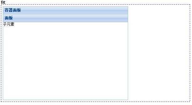
这个布局下子元素会独占全部的容器空间,一般用于只有一个子项的情况。
[Js]
|
1
2
3
4
5
6
7
8
9
10
11
12
13
|
//fitExt.create(‘Ext.Panel‘, { title: ‘容器面板‘, renderTo: ‘div7‘, width: 400, height: 300, layout: ‘fit‘, items: [{ title: ‘面板‘, html: ‘子元素‘, border: false }]}); |
效果如下:
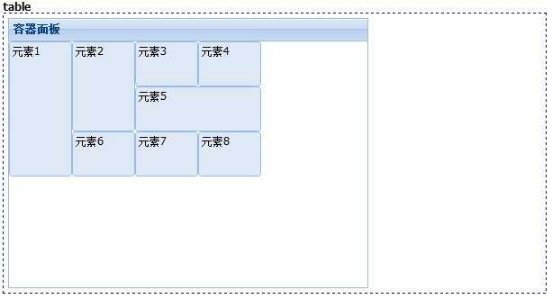
这个布局用表格定位的方式去组织子元素,我们可以像表格一样设置rowspan和colspan。
[Js]
|
1
2
3
4
5
6
7
8
9
10
11
12
13
14
15
16
17
18
19
20
21
22
|
//tableExt.create(‘Ext.Panel‘, { title: ‘容器面板‘, renderTo: ‘div8‘, width: 400, height: 300, layout: { type: ‘table‘, columns: 4 }, defaults: { frame: true, width: 70, height: 50 }, items: [ { html: ‘元素1‘, rowspan: 3, height: 150 }, { html: ‘元素2‘, rowspan: 2, height: 100 }, { html: ‘元素3‘ }, { html: ‘元素4‘ }, { html: ‘元素5‘, colspan: 2, width: 140 }, { html: ‘元素6‘ }, { html: ‘元素7‘ }, { html: ‘元素8‘ } ]}); |
效果如下:
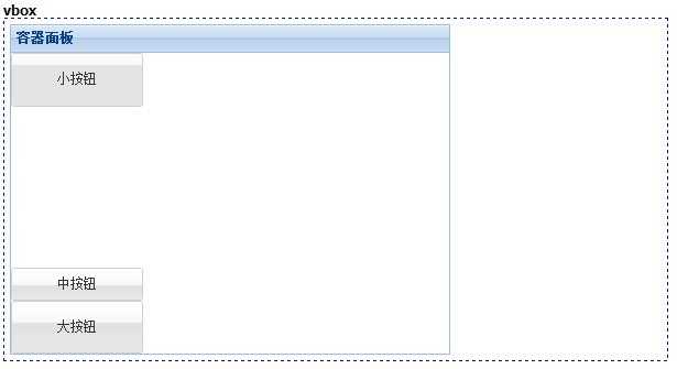
这个布局把所有的子元素按照纵向排成一列。
[Js]
|
1
2
3
4
5
6
7
8
9
10
11
12
13
14
15
16
17
18
19
20
21
22
23
24
25
26
27
28
29
30
31
32
|
//vboxExt.create(‘Ext.Panel‘, { title: ‘容器面板‘, renderTo: ‘div9‘, width: 400, height: 300, layout: { type: ‘vbox‘, pack: ‘start‘, //纵向对齐方式 start:从顶部;center:从中部;end:从底部 align: ‘stretchmax‘ //对齐方式 center、left、right:居中、左对齐、右对齐;stretch:延伸;stretchmax:以最大的元素为标准延伸 }, defaults: { xtype: ‘button‘ }, items: [{ text: ‘小按钮‘, flex: 1 //表示当前子元素尺寸所占的均分的份数。 }, { xtype: ‘tbspacer‘, //插入的空填充 flex: 3 }, { text: ‘中按钮‘, scale: ‘medium‘ }, { text: ‘大按钮‘, width: 120, scale: ‘large‘, flex: 1 }]}); |
效果如下:
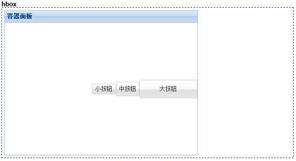
跟vbox类似,只不过变成了横向的。
[Js]
|
1
2
3
4
5
6
7
8
9
10
11
12
13
14
15
16
17
18
19
20
21
22
23
24
25
|
//hboxExt.create(‘Ext.Panel‘, { title: ‘容器面板‘, renderTo: ‘div10‘, width: 400, height: 300, layout: { type: ‘hbox‘, pack: ‘end‘, align: ‘middle‘ //对齐方式 top、middle、bottom:顶对齐、居中、底对齐;stretch:延伸;stretchmax:以最大的元素为标准延伸 }, defaults: { xtype: ‘button‘ }, items: [{ text: ‘小按钮‘ },{ text: ‘中按钮‘, scale: ‘medium‘ }, { text: ‘大按钮‘, width: 120, scale: ‘large‘ }]}); |
效果如下:
原文:http://www.cnblogs.com/BTMaster/p/4082539.html