首先,推荐一个讲Matlab画图的链接,该文中的画图方法比较基础,入门很快。
http://blog.csdn.net/wangcj625/article/details/6287735
下面给出一个例子。
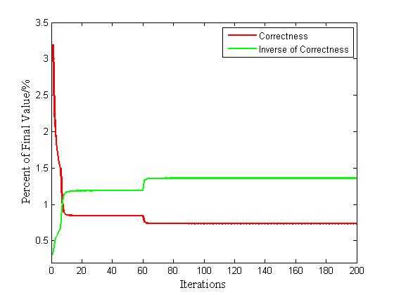
eg. 有两条曲线,X轴的区间是相同的,并且采样点个数相同。第一条曲线使用红色,第二条曲线使用绿色。需要标识出X轴坐标名称和Y轴坐标名称,还需要对标识出曲线名称。
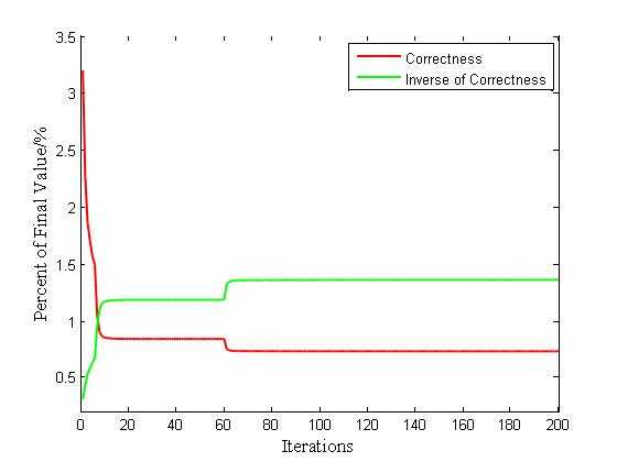
Matlab作图看上去是没有反锯齿的,但可以生成矢量图格式,比如pdf和eps等。再通过Corel Draw生成wmf格式的矢量图,这样就可以在word中加入矢量图格式。此外Matlab有开启smoothing的函数,但开启smoothing后,pdf格式输出的文件就不是矢量图咯~因此推荐第一种方式生成矢量图。
上面的图就是开启smoothing功能的效果图。
Val1 = load(‘data1.txt‘);           % Load the data
Val1 = Val1‘;                       % matrix transpose
Val1 = 100*Val1;                    % Enlarge the data by 100
Val2 = 1./Val1;
X = 1:1:424;
curvehandle = plot(X,Val1,‘r-‘,X,Val2,‘g-‘,‘linewidth‘,1.5);    % plot the curve with red real line and linewidth is 2
set(curvehandle,‘linesmoothing‘,‘on‘);
xlabel(‘Iterations‘,‘fontname‘,‘Times New Roman‘,‘fontsize‘,12);
ylabel(‘Percent of Final Value/%‘,‘fontname‘,‘Times New Roman‘,‘fontsize‘,12);
legend(‘Correctness‘,‘Inverse of Correctness‘);
axis([0,200,0.2,3.5]);              % Set the boundary
原文:http://www.cnblogs.com/JunxuanBai/p/4138295.html