Usually when desgin a web page, we think building the page in grid.
Bootstrap can help us to do that.
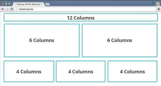
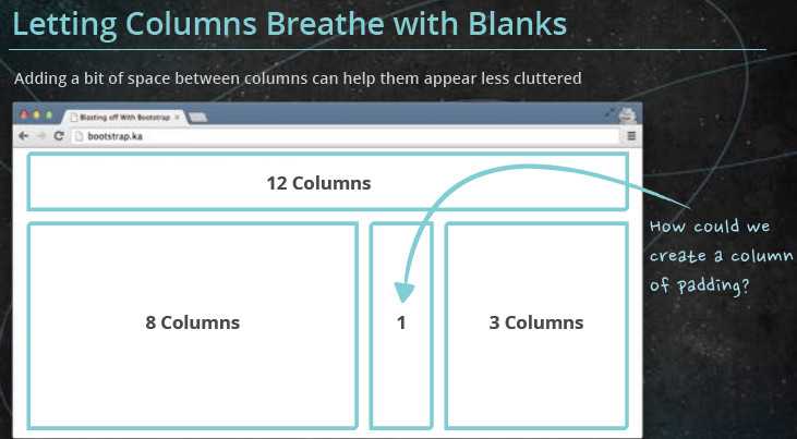
It divides the page into 12 cols. In the picture, there are three rows, on the top is header (it takes 12 cols), in the middle there is two cols, in the bottom, there are three cols.
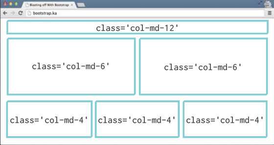


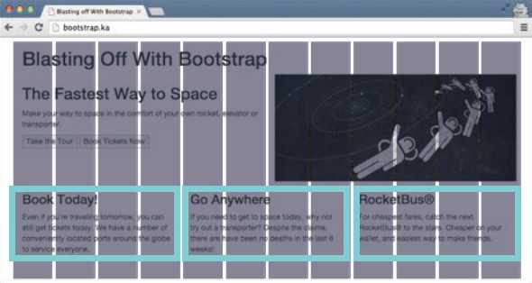
You can finish this work quickly by using ‘col-md-x‘ class: it should sum up to 12 for each row.
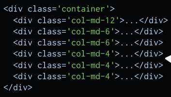
To organize the code structure better, you can but add ‘row‘ class:
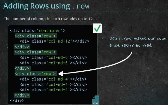
If one row exceeds 12 cols, the page layout would broken.
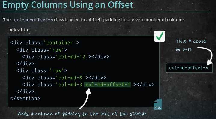
If you want to add more padding:
You can use ‘col-md-offest-x‘ class:
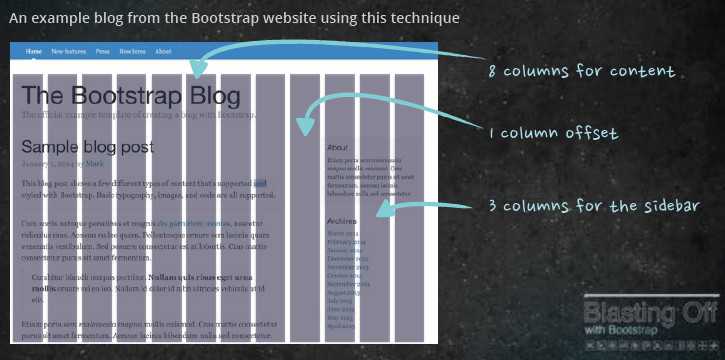
Result:
[Bootstrap] 2. class 'row' & 'col-md-x' & 'col-md-offset-x'
原文:http://www.cnblogs.com/Answer1215/p/4294314.html